

Summary
The BMI Calculator is an interactive element the WebMD ONE users use to calculate their BMI while registering for a behavior change weight management plan. My role as Product Designer included updating the tools' UI to align with the company's Material UI Design System, usability testing, and coordinating an accessibility review.
Status Live Product
Timeline 07/06-07/10/2020
Major Tasks Develop UX/UI
Platforms Responsive Web and Mobile App
Design Tools Sketch
Marvel
Usertesting.com
Jira
Marvel
Usertesting.com
Jira
UX Methods General Research
UI Concepts
Usability Testing
Prototype
UI Concepts
Usability Testing
Prototype
Collaborators Jesse Hambley, Accessibility Review
Bryan Jayne, Senior Design Review
Connie Ven, Product Manager
Bryan Jayne, Senior Design Review
Connie Ven, Product Manager
Process
Research and Planning
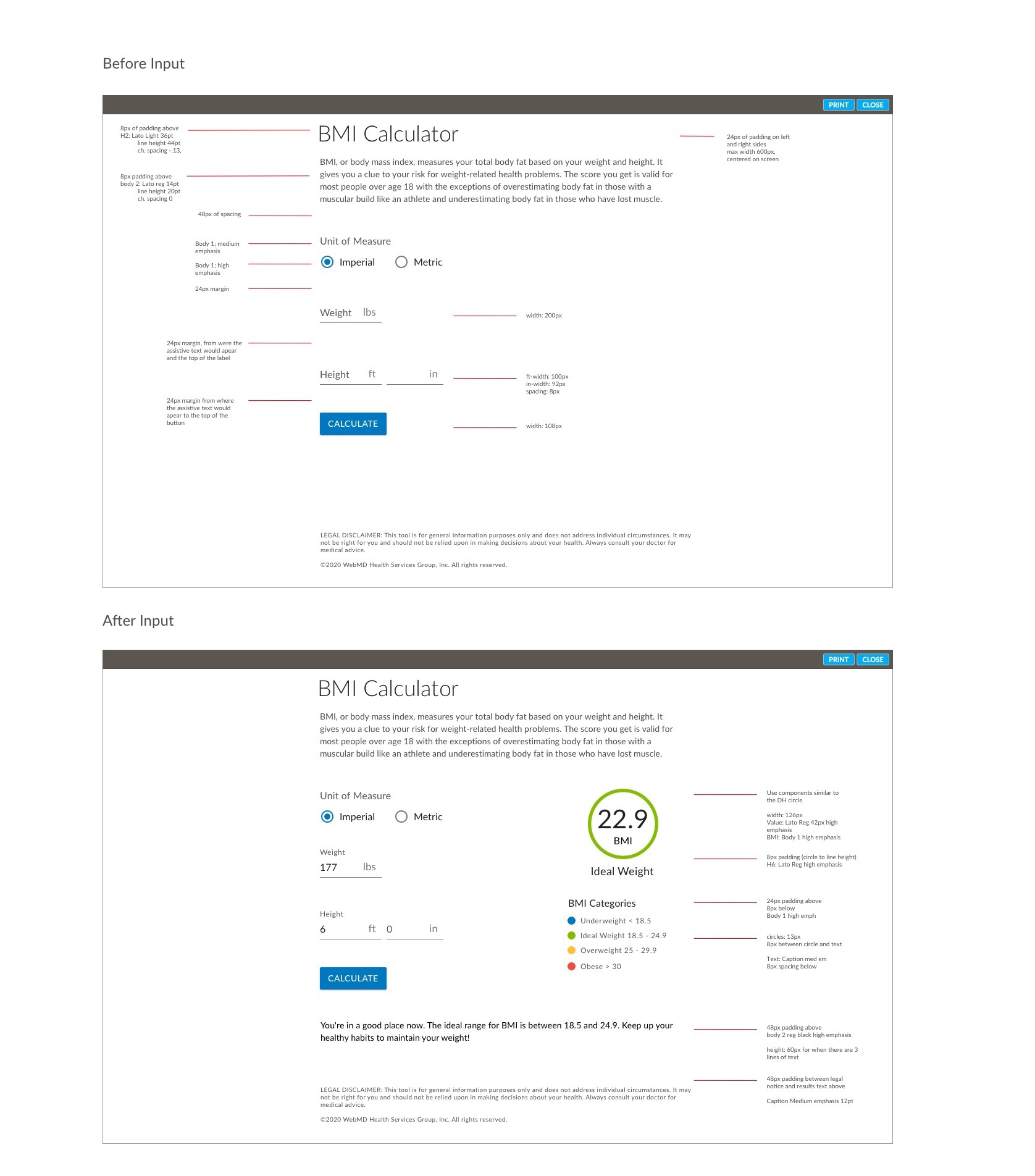
Initial Tool UI
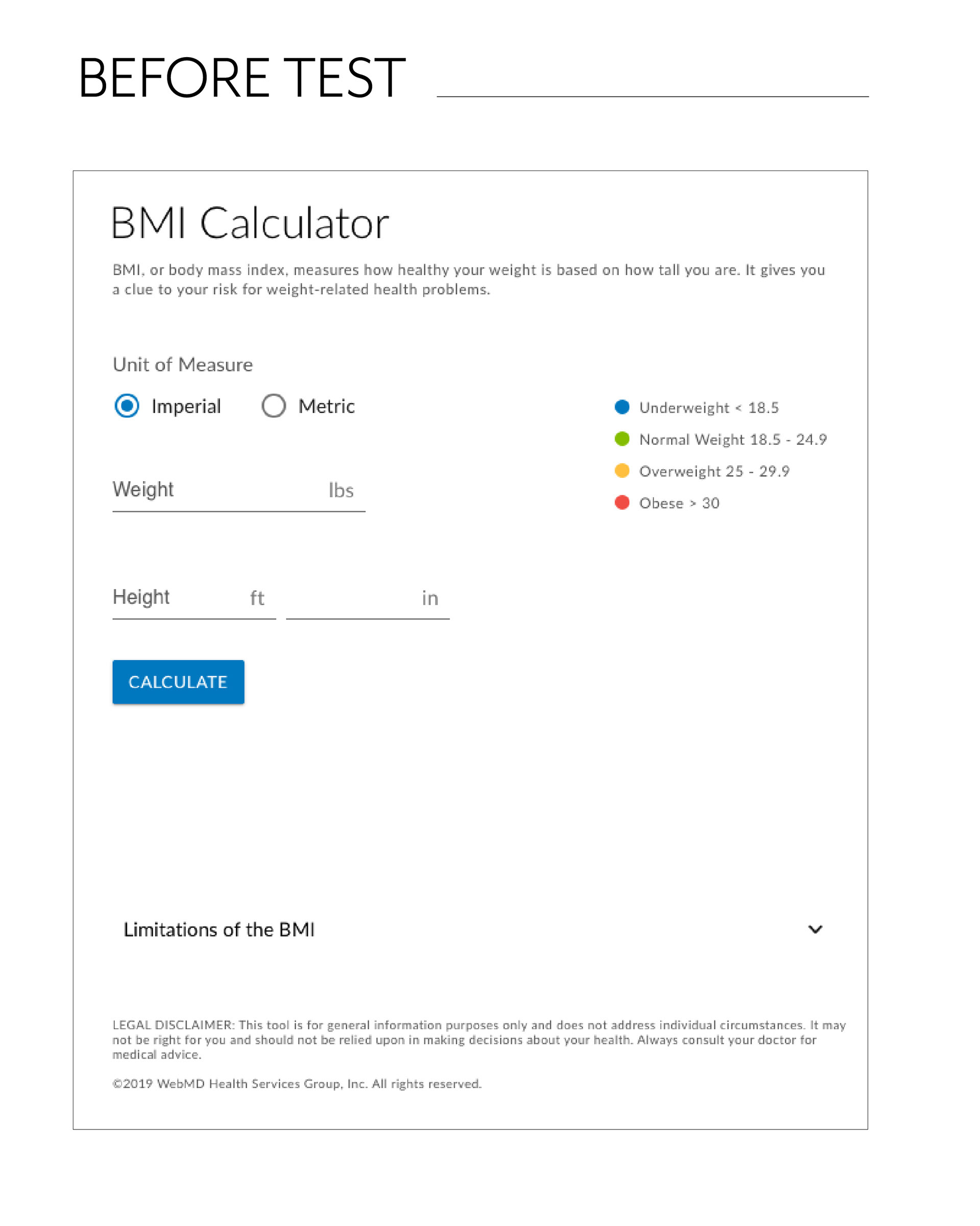
Before diving into the design, I started by reviewing the current BMI Calculator tool. I quickly noticed that the form area for the tool was quite small and the BMI results displayed with little visual impact after submitting the form. I saw the opportunity to better prioritize the hierarchy of the page as well as provide better visual emphasize for the BMI results.

calculator before user input
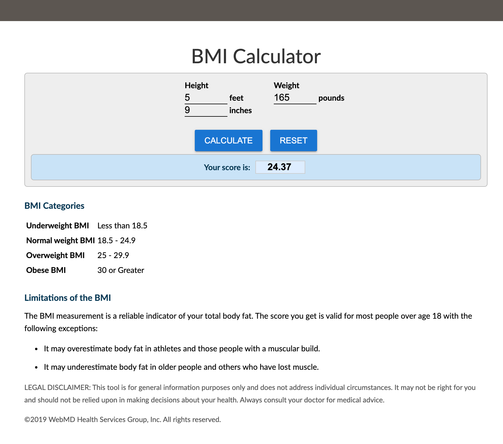
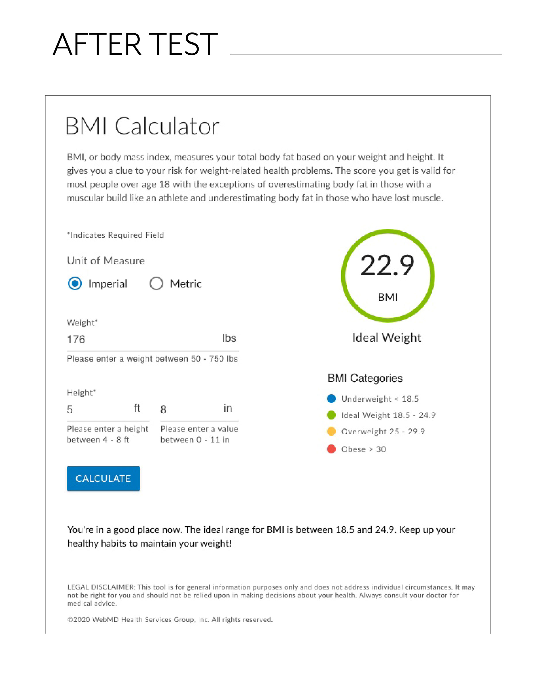
Results after user input
Competitor Analysis
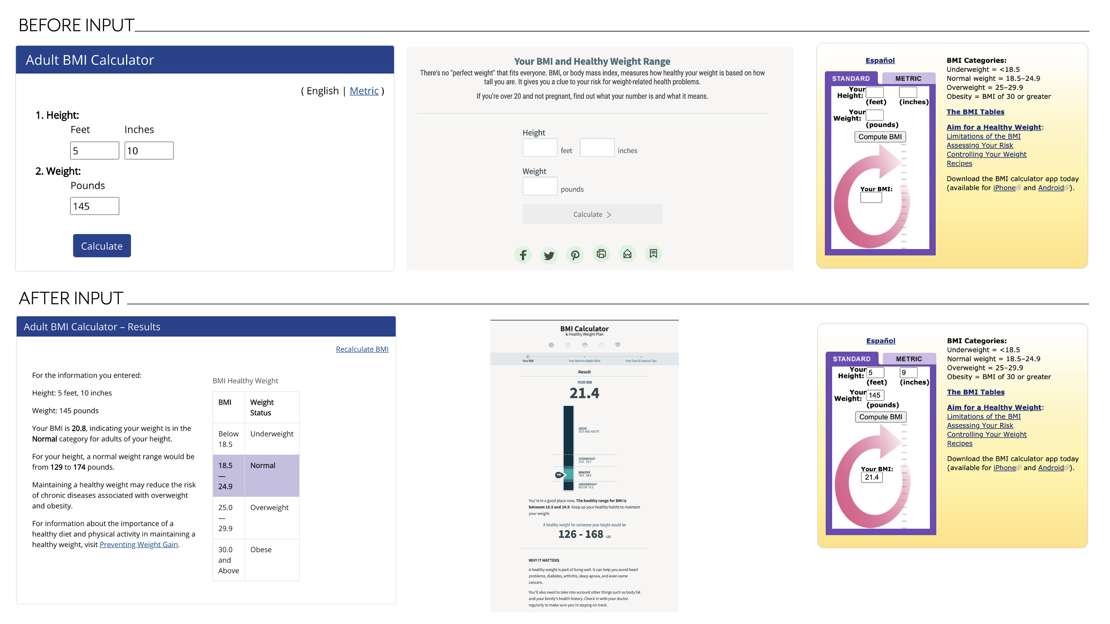
I continued researching by reviewing other BMI calculators to gain an understanding of the UI patterns that already existed for these tools. I reviewed the calculator on the websites of the CDC, NHLBI, and on the WebMD Health Services' parent company's site.
I noticed that these other calculators offered a metric setting. Based on the our roadmap goals to expand our product further into the international market, I recommended to the Product Manager that we also add a Metric option to our BMI tool.
–––––––––––––––
Design
UI Concepts
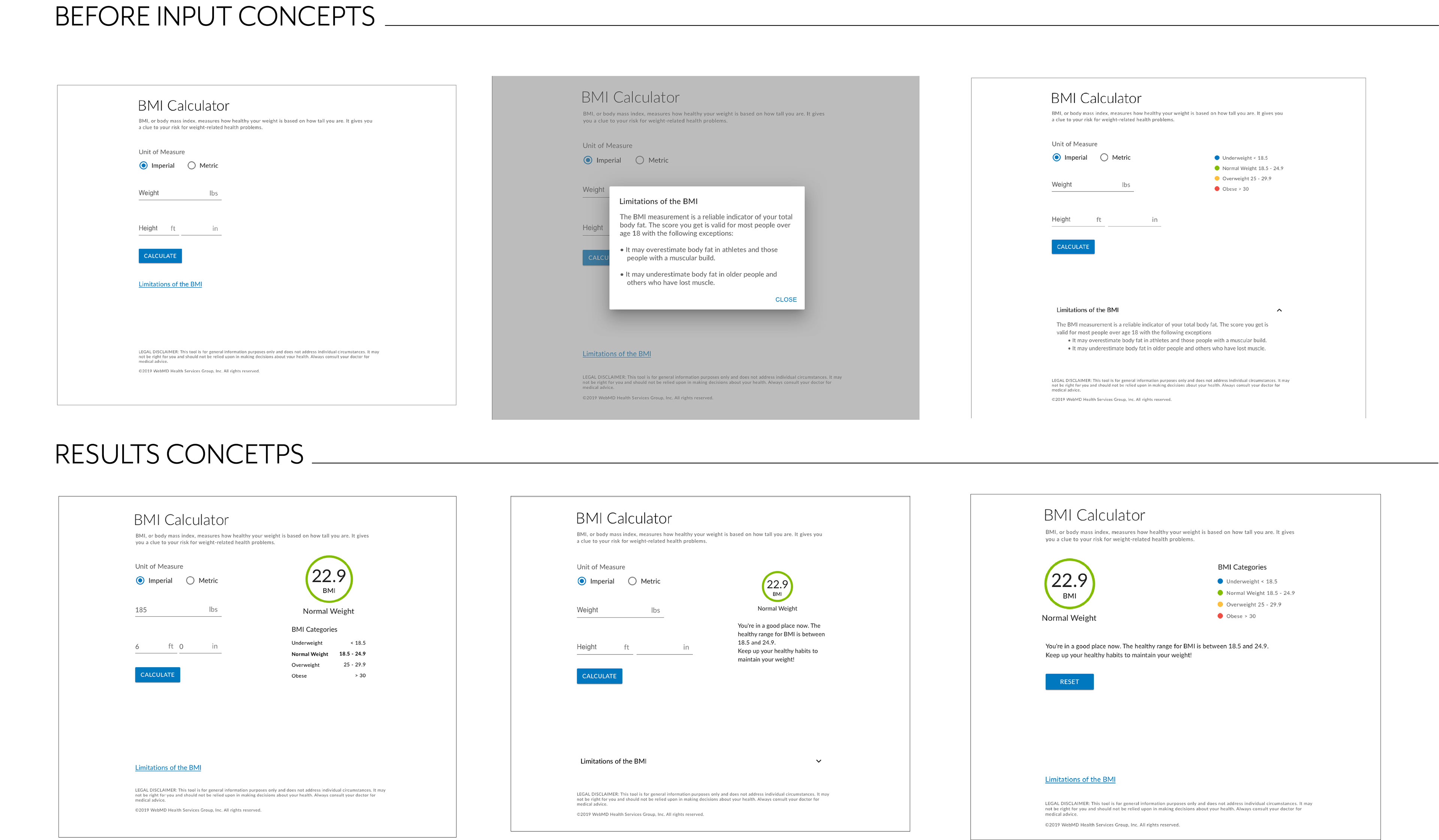
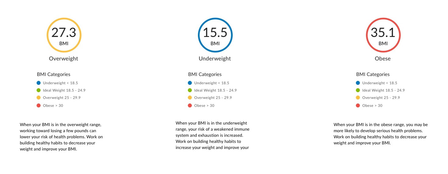
With a strong understanding of the requirements, I began the tool concepts. I experimented with adding color to each BMI category to help signify to the user which category their result was in. I also iterated on the layout by starting with a version where the results page and form intake were 2 separate page. But to make it easier for the user to reuse the form, I decided a side by side 2 column layout would be more usable.
Content Strategy
While concepting the initial designs, I saw an opportunity to provide the user with more context to what the BMI measures and what it is. I also saw the opportunity to add content after the user's calculated their results, so that user's could have more insight into what their BMI number might mean for them.
Accessibility Review
Next, I reviewed the concepts with the team's accessibility expert, to make sure the tool aligned with our product's requirements to be compliant with the WCAG 2.0.
The main feedback noted was to avoid utilizing the modal I'd included to handle the legal text surrounding the limitations of the tool. I had initially used this pattern to avoid cluttering the page with content users likely wouldn't refer to. However, with the accessibility feedback, I shifted the design to utilize an accordion rather than the linked modal version.
–––––––––––––––
Testing
User Test
To validate the design decisions, I created a qualitative usability test which I ran using Usertesting.com's remote usability testing features.
The goal of the test was to discover any usability opportunities I may have missed in the initial mockups. I included mainly testers from the United States but made sure to include a few users from countries that use the Metric scale.
Result
Overall the tool preformed as expected with the users. The biggest opportunity that presented itself based on testing, was around the "Limitations of the BMI" copy.
Users felt the copy was important to see since BMI tests are not measurements of a person's health. They felt placing it at the bottom of the screen made it very hard to notice.
I decided to rework the limitations copy to be included in the introduction to the tool. This solution aligned well with both the test user's concerns, and presented a more accessible pattern for handling the text by not hiding it on the overall page.
–––––––––––––––
Impact
Developer Handoff
With the tool's final design complete, I proceeded to document implementation notes for the development team. I called out certain elements from the team's Design System and presented both the Desktop and Responsive Mobile versions.
Conclusion
The design has been implemented and added to the live product's flow. The revised tool modernized the existing functionality, while providing the user with more context around their BMI results. Finally, the updated UI also provides a more comprehensive experience for the user as it aligns with the rest of the product's UI.