
Summary
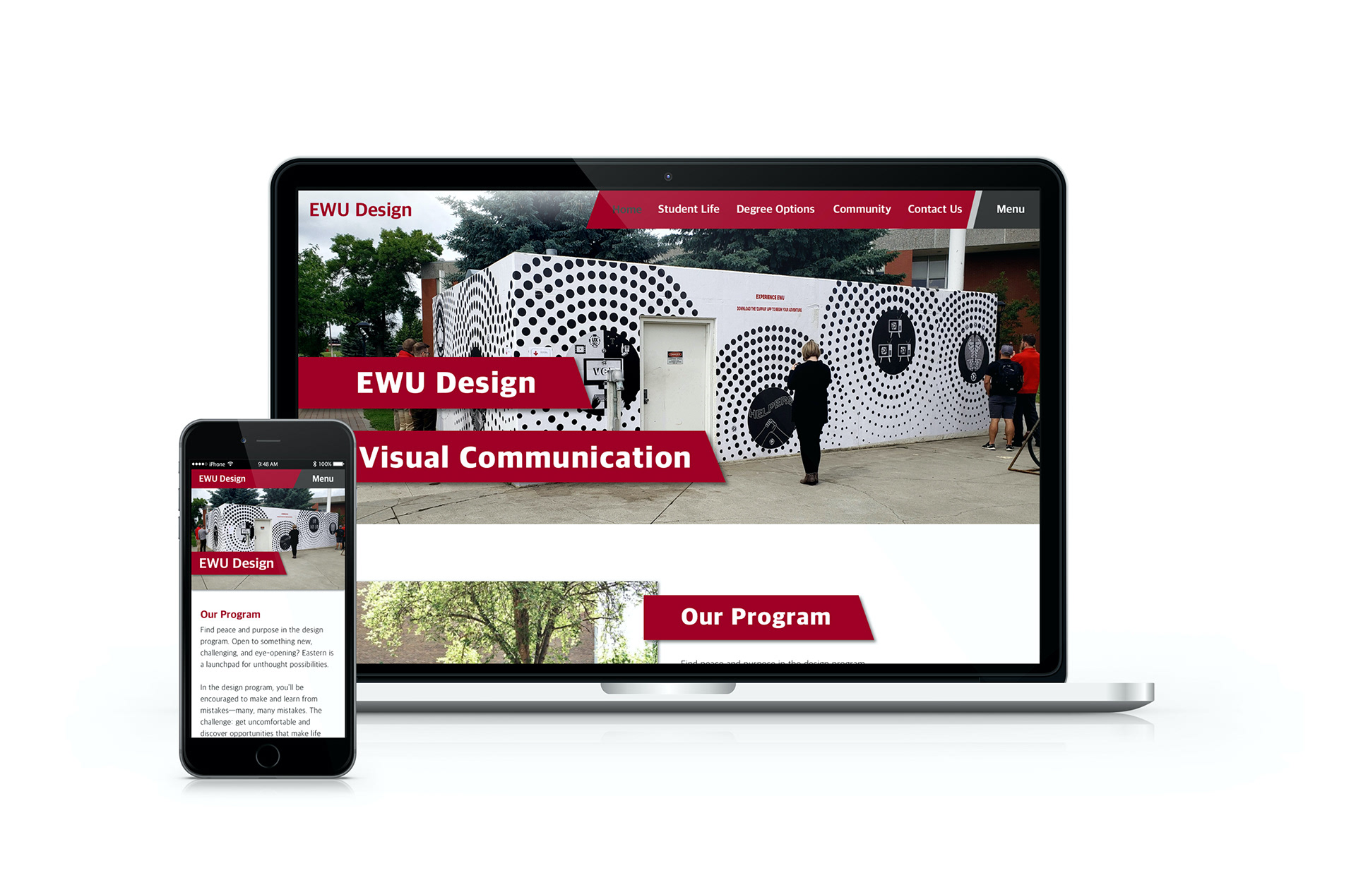
Eastern Washington University's Department of Design website is an informative site that allows potential, current, and past students to access what is currently happening within the EWU Design program. The previous site was outdated and difficult to navigate. My role as designer included researching layouts and visual style, organizing the site map, and creating the final user interface prototype.
Status Concept
Timeline 06/03/19-06/13/19
Major Tasks Develop UX/UI
Copywriting
Copywriting
Platforms Desktop / Mobile
Design Tools Sketch
Invision
Adobe Photoshop
Google Sheets
Invision
Adobe Photoshop
Google Sheets
UX Methods SWOT Analysis
Competitive Assessment
Content Map
Information Architecture
Wireframes
Competitive Assessment
Content Map
Information Architecture
Wireframes
Collaborators Tyreil Poosri (Instructor)
Process
Research
SWOT Analysis
I used the SWOT Analysis to help identify Strengths, Weaknesses, Opportunities, and Threats to the redesign of the EWU Design website. The analysis helped me identify the growth areas I should highlight in the new website, and the areas that would pose challenging to integrate.

Original Program website

SWOT Analysis Results
Competitive Assessment
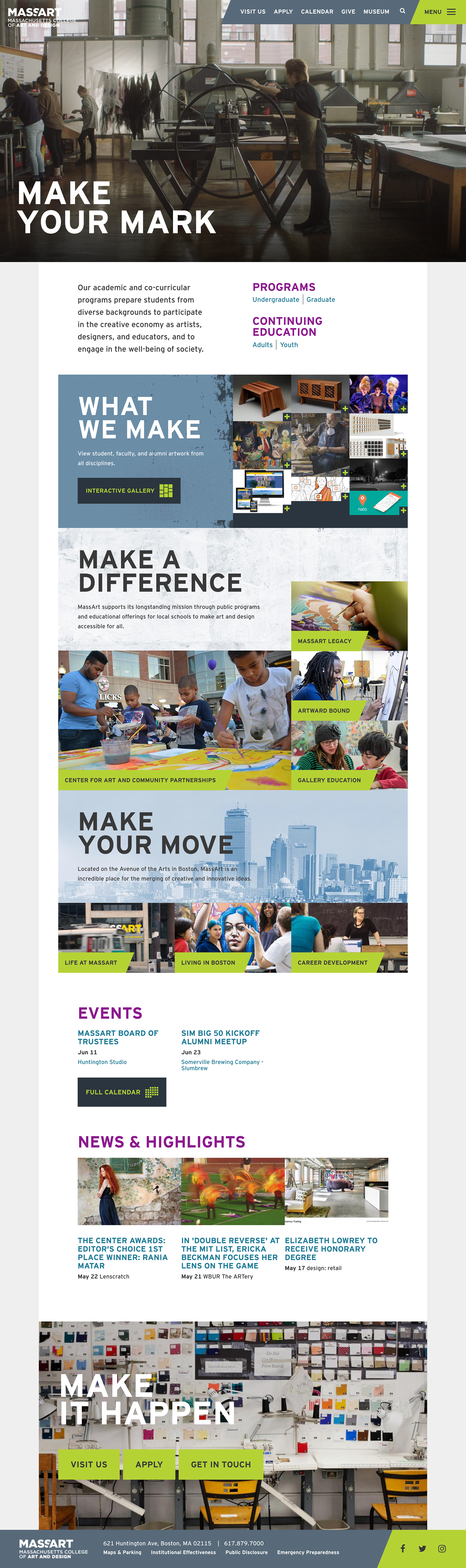
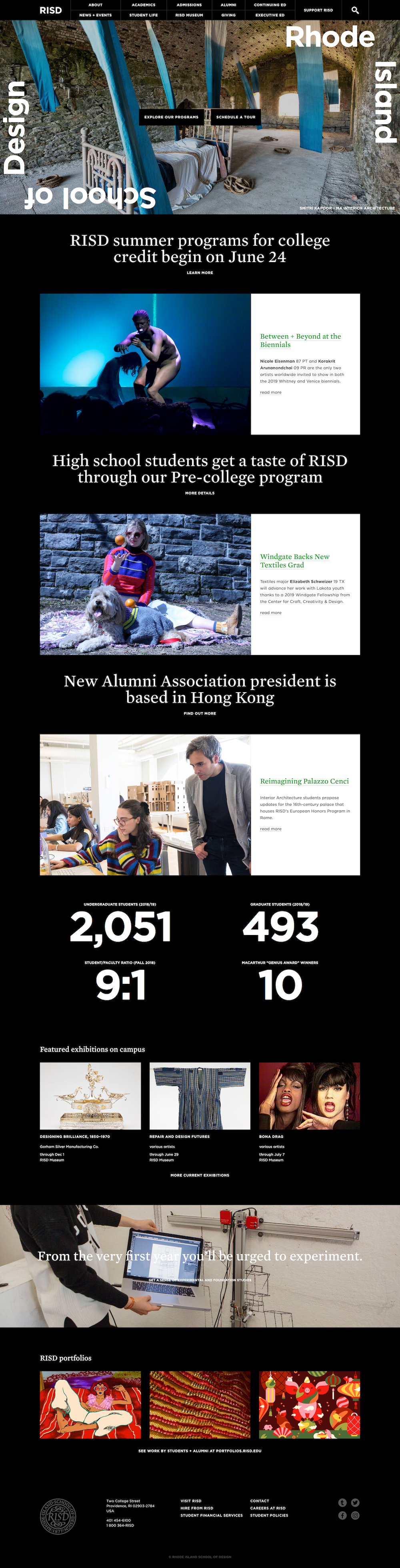
In the competitive assessment, I visited other academic sites to compare to the current program site. I found other sites had more student work available, brighter more inviting interfaces, and good information hierarchy.
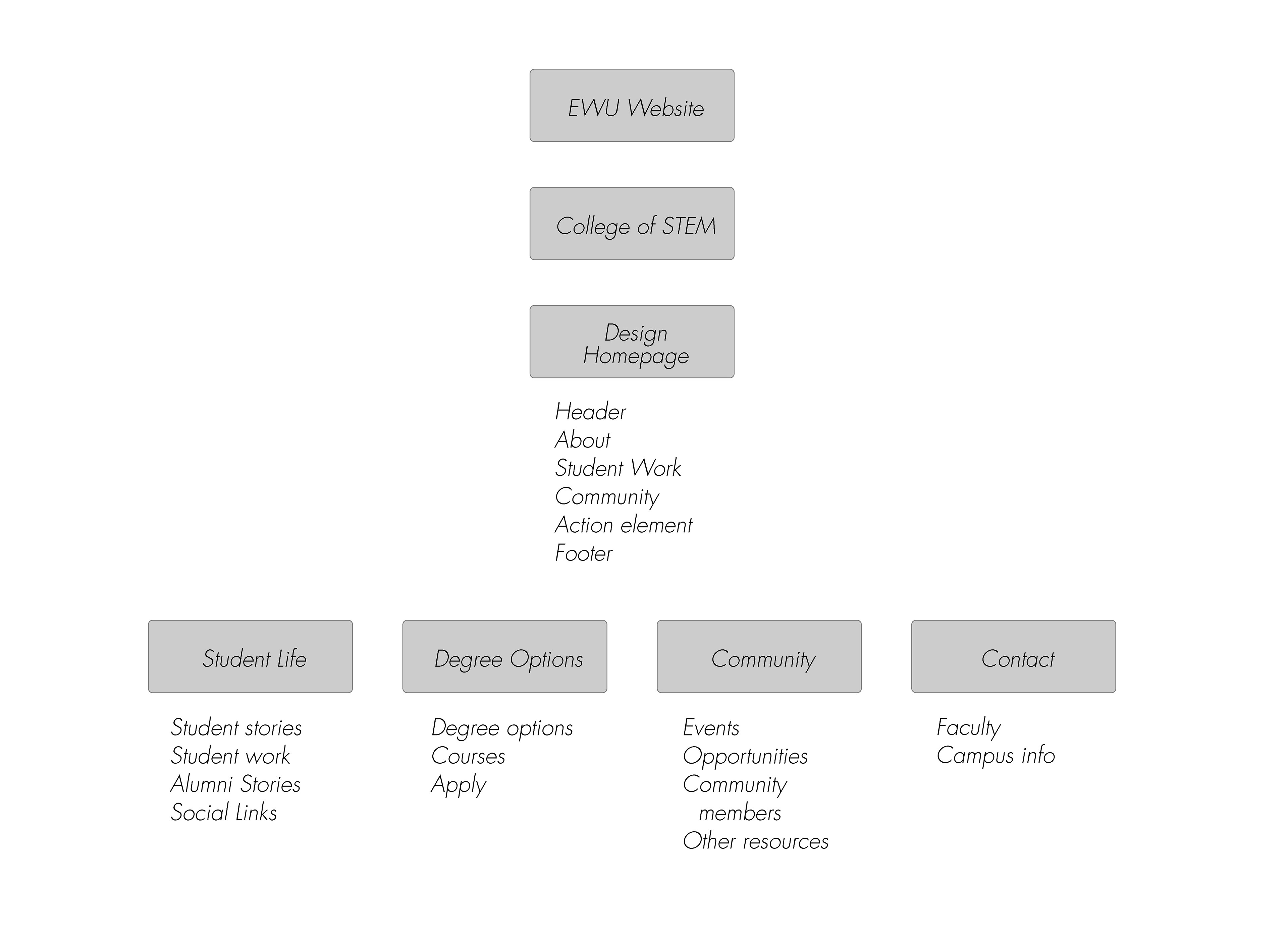
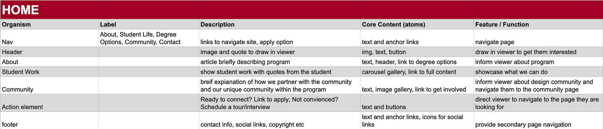
Site and Content Map
With the the key priorities and competitor sites in mind, I created a site map to organize the content. Then used this as an outline to create a content map for each page. These maps helped me highlight the priorities identified in the SWOT analysis and organize each page so that information could be found and accessed easily.
–––––––––––––––
Design
Digital Wireframes
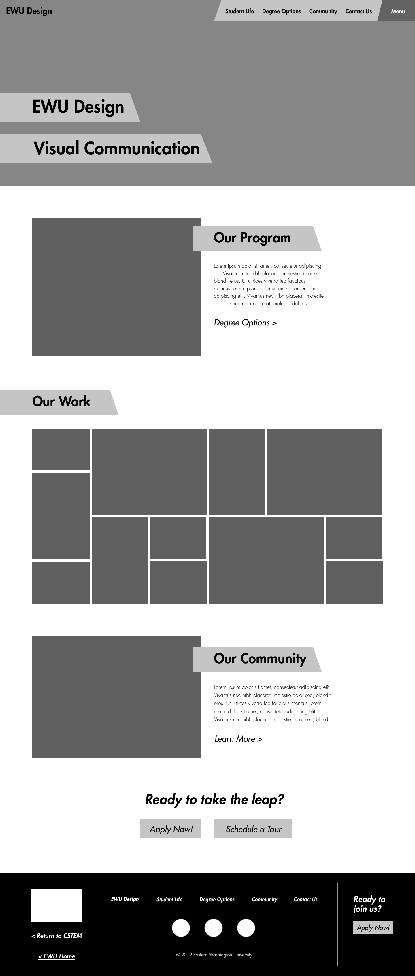
I used the content map as a base for each page and began creating wireframes for both the mobile and desktop versions of the site. I decided to use a rectangle with a diagonal trimmed corner to create a more dynamic and energetic space.

Style Tiles
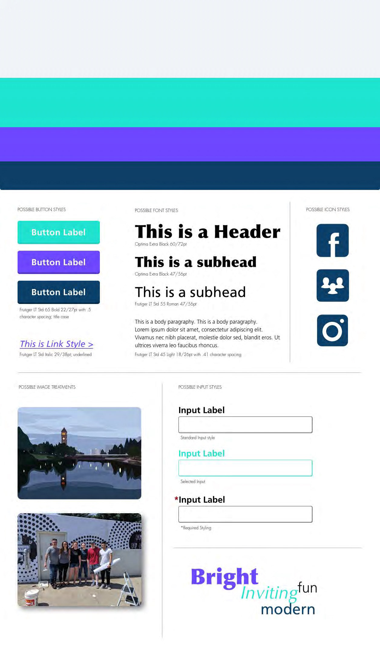
I created 2 versions for the website style. I based one off the University brand guidelines and the second I created based on my competitive assessment. I wanted to experiment with off brand colors and shapes that would feel inviting for the viewer, and to see if this would spark more creativity in developing the site UI.
I ultimately decided to go with the more Eastern themed style since the program is part of EWU. I did incorporate some of the elements from the second style tile, such as the form fields and the image treatments as these supported the EWU style tile better.

Hi-fidelity Prototype
With the visual style defined, I began adding the style elements to the different Sketch symbols previous used in the low fidelity digital wireframes. I made sure to include version of each symbol for both the desktop and mobile platform.
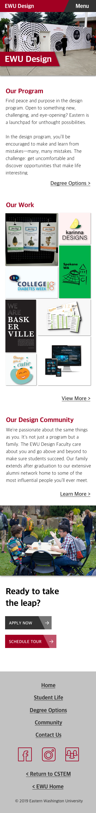
The final prototypes include example images of actual work from the students in the program, program events, and current faculty. The copy I also included to help the site feel more realistic. The initial copy was pulled from the previous site with some edits; other sections required me to completely write new copy.

–––––––––––––––
Impact
The main criticism on the site was the shadow treatment on the images, especially the ones in the "Our Work" grid. The shadow combined with the small gutter made some viewers feel the images were too tightly packed and needed more space to breath. Reflecting on this, I would agree. If I went to redesign the project, I would pay more attention to how the images are treated and the off set headers. Overall though, I am very happy with the process and design that went into this project.