Design
KBA Questionnaire
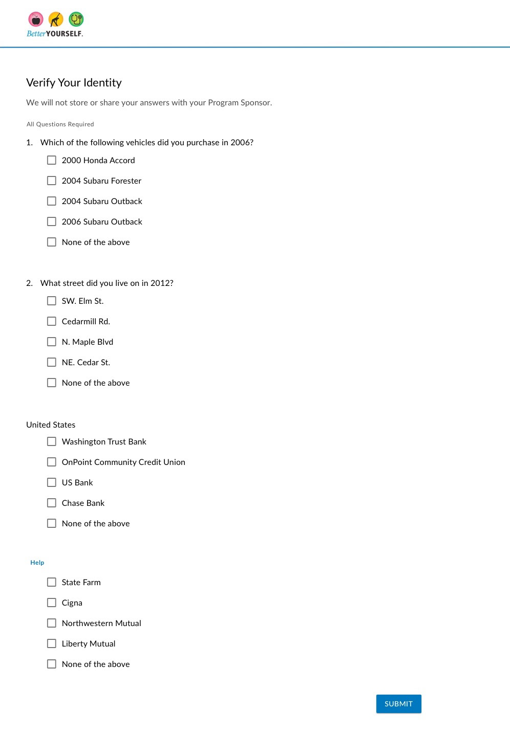
I developed 2 main flows for the create account and 2 factor authentication sign up flow. In 1 flow, the KBA questions were shown in a single list, and the 2nd they were presented one at a time.
I initially had planned to present the questions in a single list to allow the user to quickly read and answer the question; especially since the vendor providing the question imposed a 90 second time limit on form. However, since the vendor also recommended the 1 at a time approach, I decided to explore both.
MFA Setup
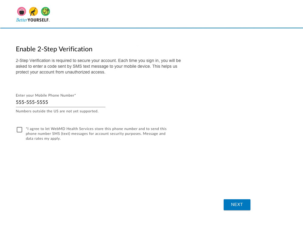
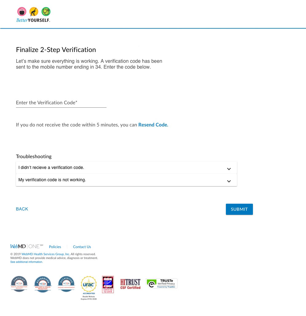
For the text message based MFA setup, I began by creating a page layout that included the main form elements necessary to setup text based authentication: mobile phone field, phone confirmation field, and permissions checkbox.
Since the design required the user to enter the first confirmation code sent to their device, I realized the confirmation field for the phone number was an unnecessary step. The user's phone number would be confirmed once they entered the security code. With this in mind I simplified the design for MFA Setup.
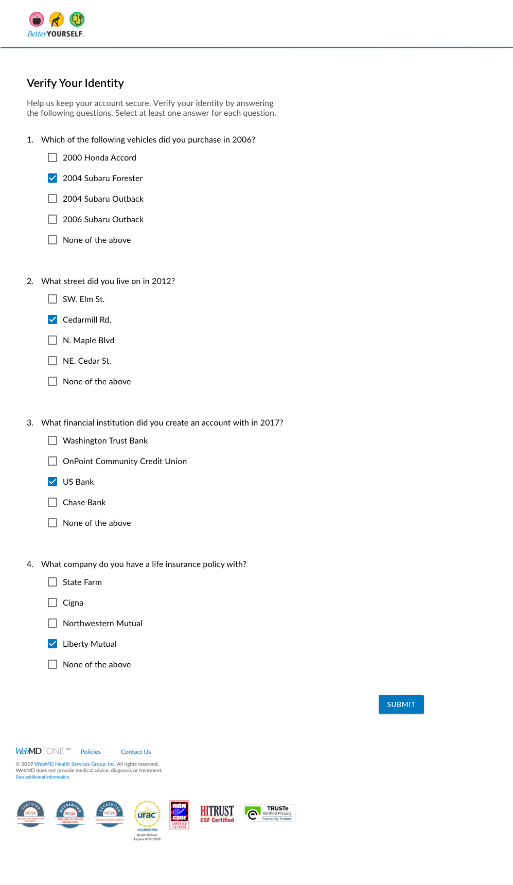
KBA Questionnaire List View
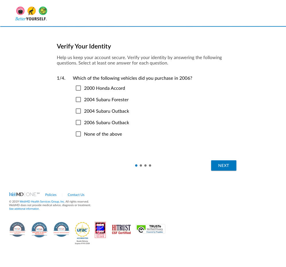
KBA Questionnaire Stepper
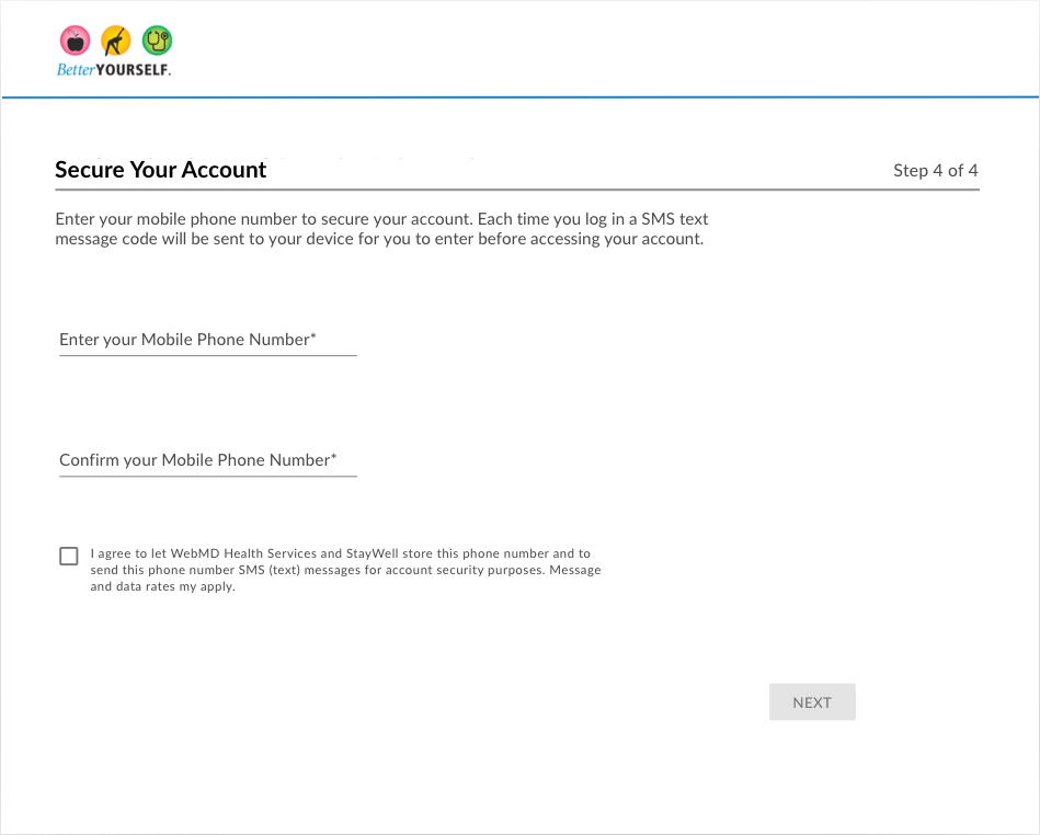
MFA Setup version 1 page 1
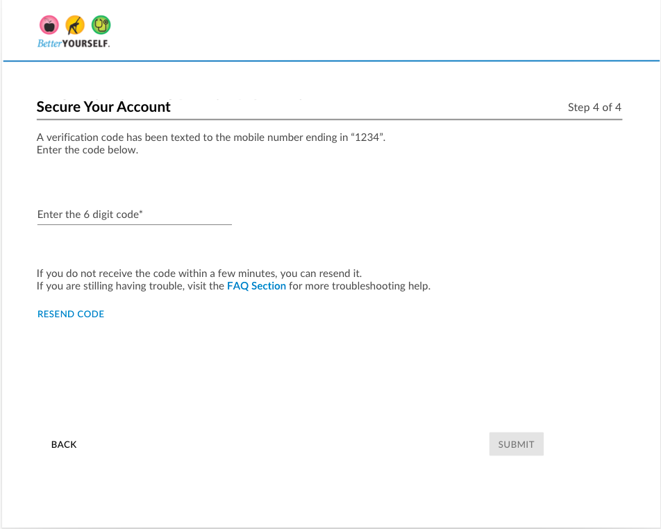
MFA Setup version 1 page 2
–––––––––––––––
Testing
KBA Form A/B Test
I created a short A/B test to help discern which model to use for the KBA questionnaire: the single list or the 1 question at a time approach.
The user preferences for these tested practically equal in the qualitative test. Because of this, I looked specifically at the preferences of the test users who belonged to our highest age demographic. This demographic showed a slight preference for the single list version.
When factoring in the 90 second time limit, the project timeline and the work it might take to implement a multiple page questionnaire, it was clear the single page version was the most optimal choice for this project.
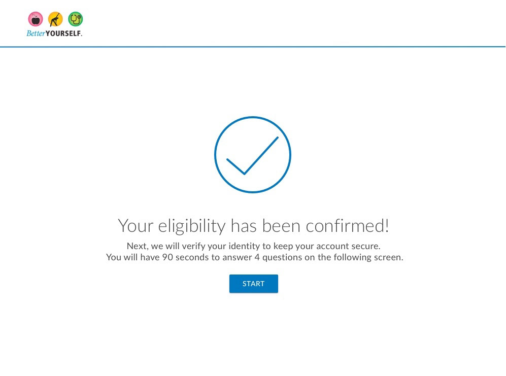
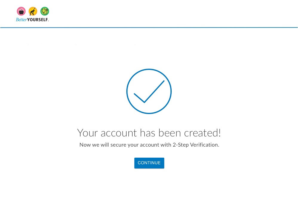
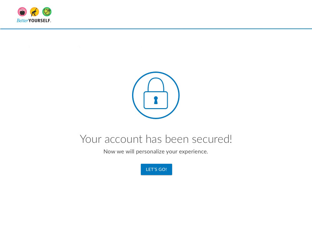
The following images show the final flow in order the user would work through the pages.
