


Design
Sign In
My first iteration of the secure sign in experience used a seperate screen that would appear for the user after entering their username and password.
However, during further iteration, I decided leveraging the existing sign in page to deliver the prompt for the 2-step verification code would be a more seamless user experience. The user wouldn't have to wait to be taken to a new page, and would have access to the FAQ section the login page already provided.
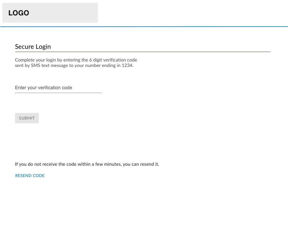
Initial layout for the full page Secure Sign in experience.
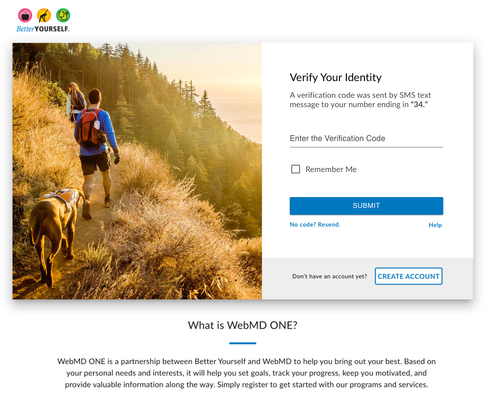
Revised Secure Sign in experience to seamlessly follow the Username and Password Prompt
User Self-Support
Since the security update would require 2 steps when a user set up their account, I wanted to be sure users had resources to support them if they were confused by the process or received an error. I decided to update the sign in page's FAQ section to handle this. I reorganized the current FAQs into 3 groups to make the section easier to scan. I also added 3 new FAQs to support the KBA and MFA security steps. The goal of adding this self help information was to help mediate the number of calls the customer service team received around the security implementation.
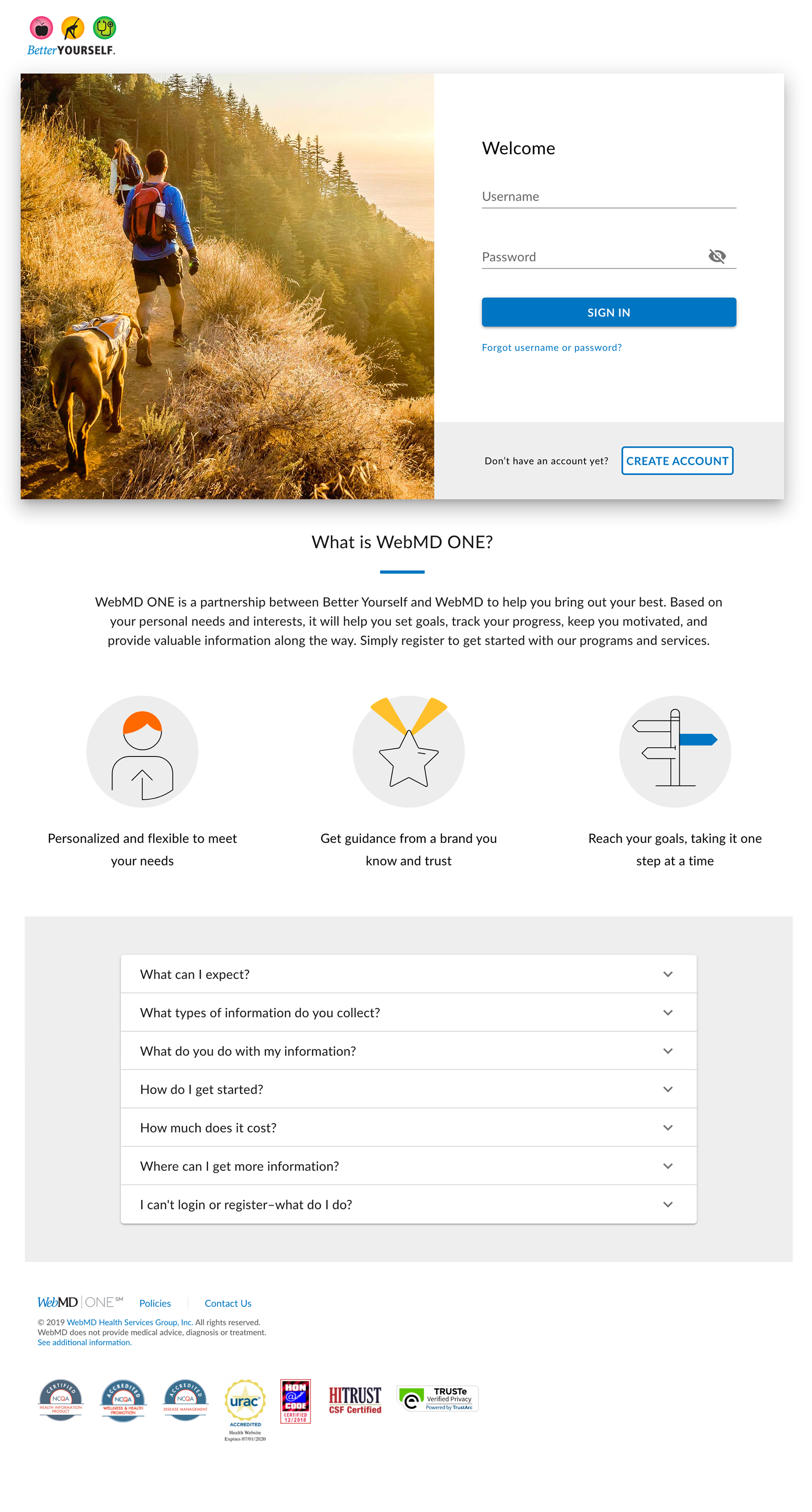
Original page design
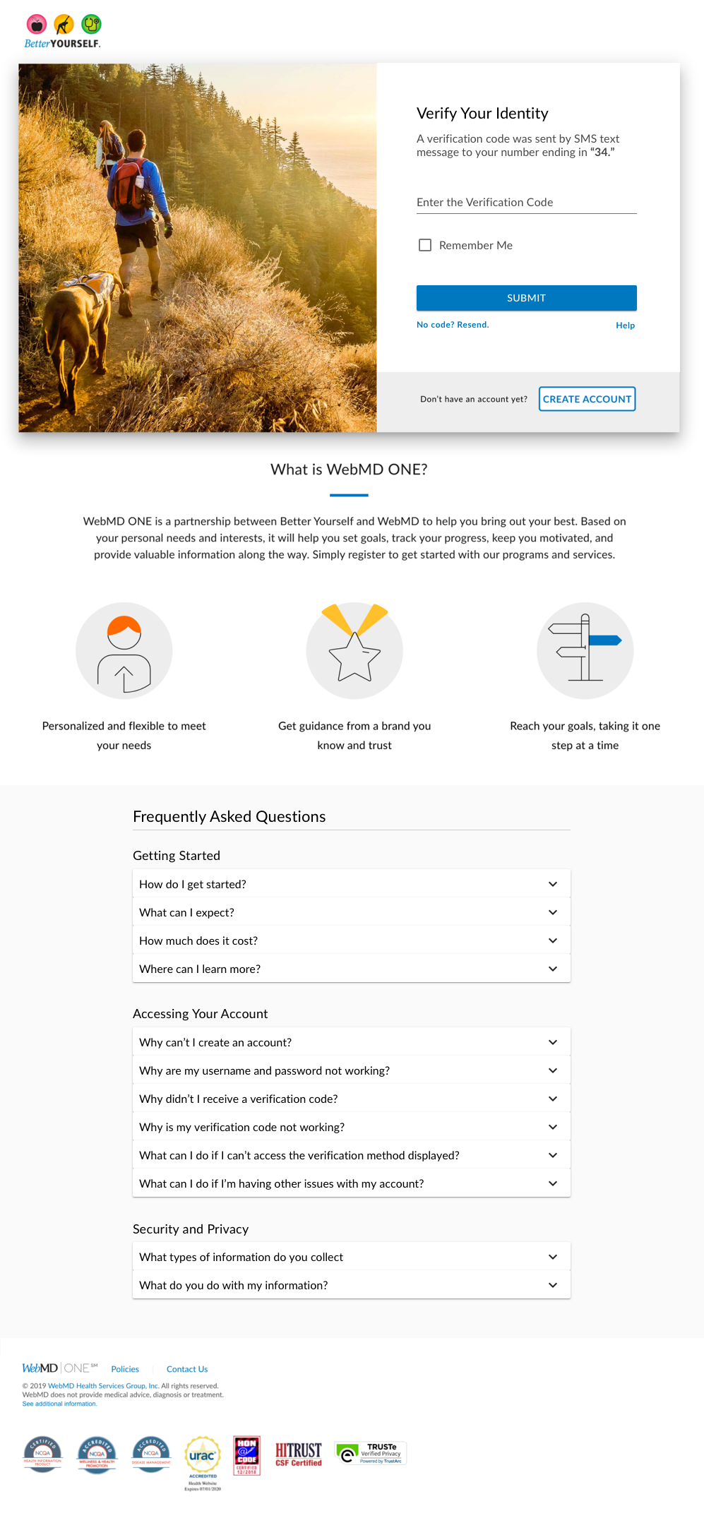
Revised Suppot section
–––––––––––––––
Testing
Usability Test
I drafted 2 usability tests to test the KBA/MFA setup and the account sign in processes on both mobile and desktop platforms.
I asked users to create an account, sign in, and review the support FAQ section. The results didn't uncover any major usability issues. However, one user did mention a scenario that had not been covered in the FAQ support section. Based on this, I revised the content in the FAQ section to include this user's concern.