
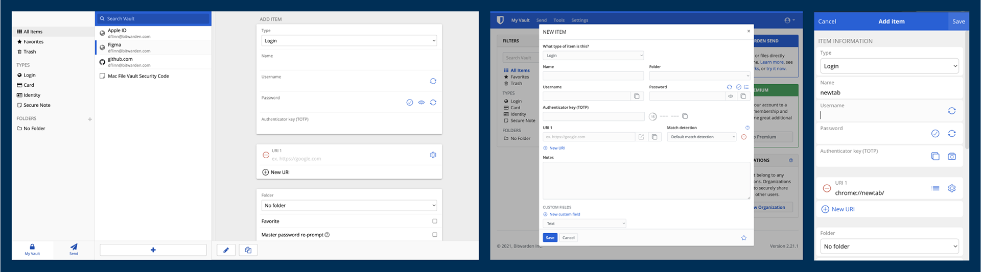
Screenshots from 2021 showing the desktop, web app, and extension interfaces all using a different UI framework
Unify the Bitwarden design language so users recognize the interface, have a more constant experience, and are more confident in Bitwarden as a product and company.
Abstract out the repetitive design decisions, so designers and engineers can focus on building the enhancements and features that make the product.
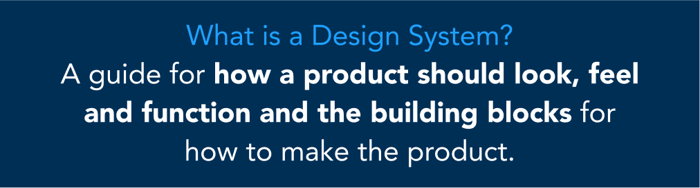
Language used in a presentation to gain leadership support.
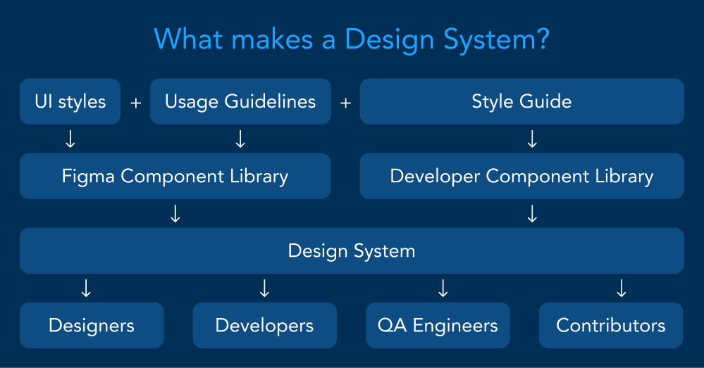
Diagram used in a presentation to gain leadership support.
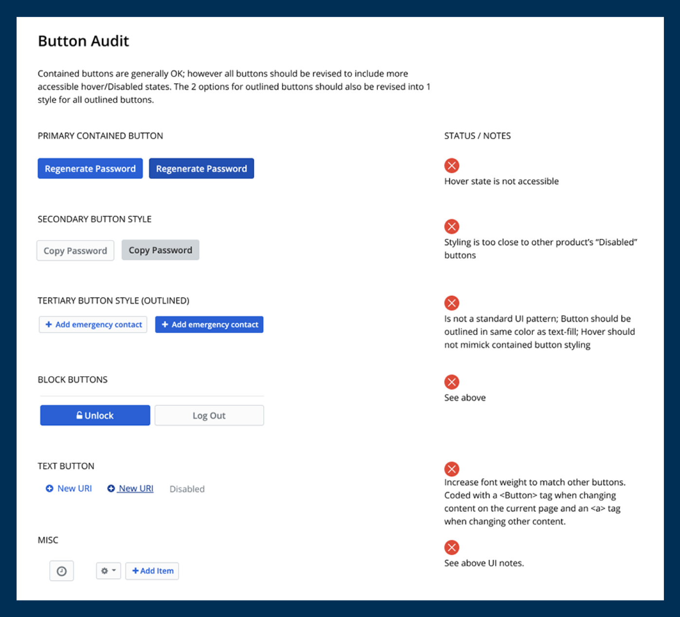
Example of audit document for the button component.
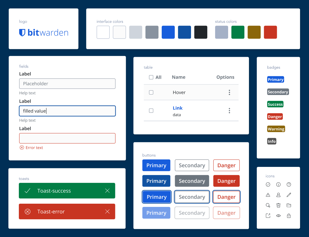
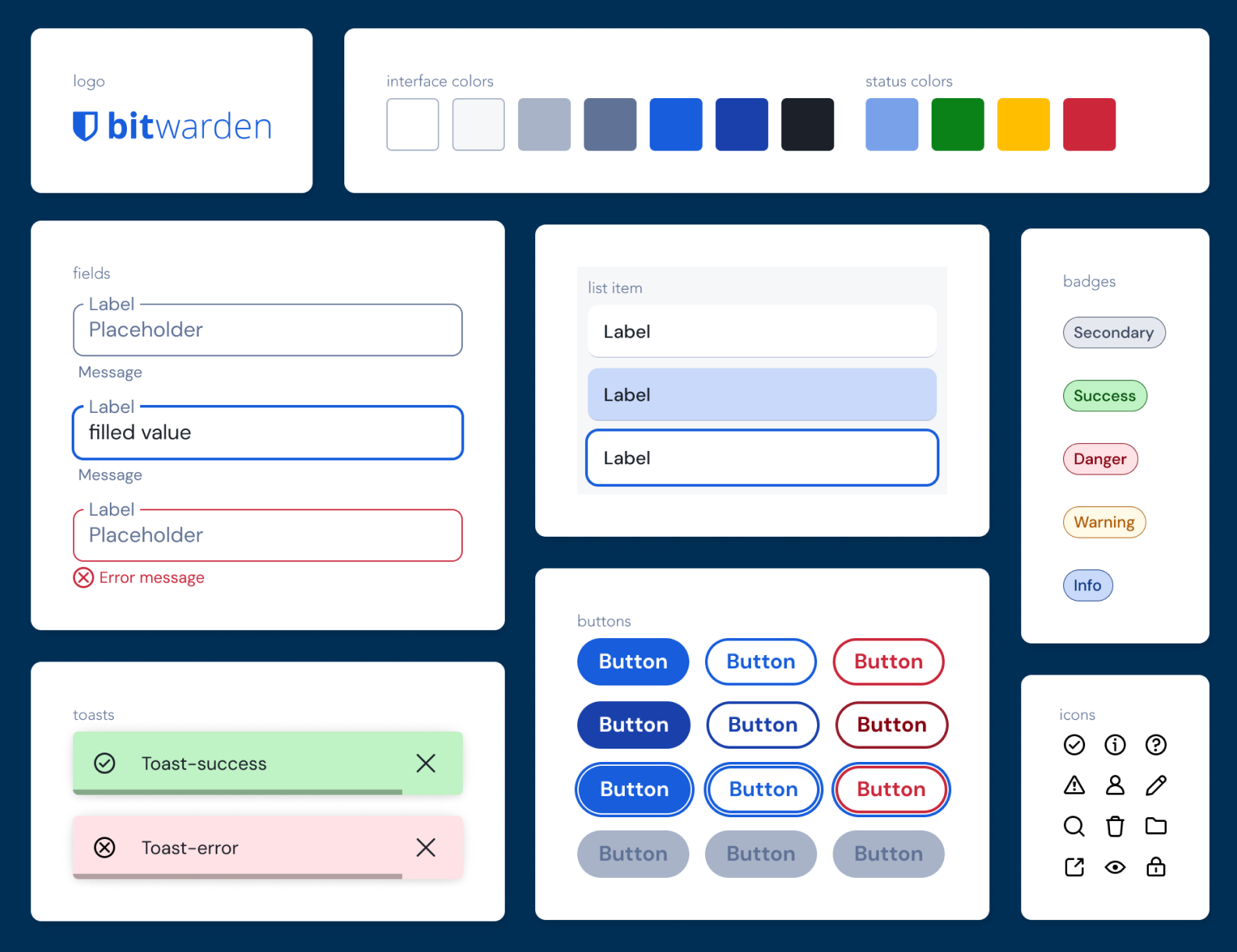
Initial design system components copying styles from the web application.
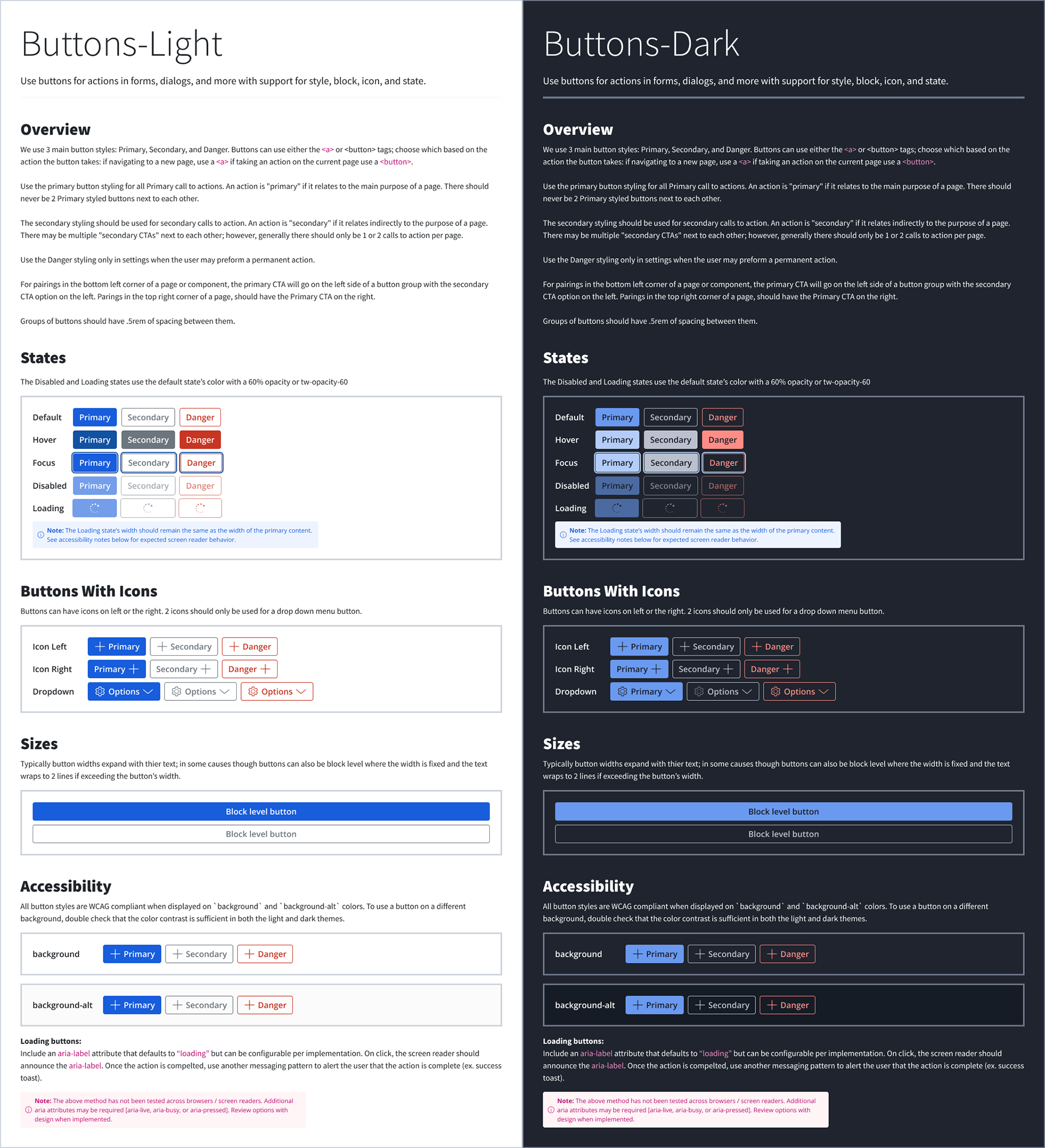
Screenshot from Figma showing button components in light and dark themes along with usage and accessibility guidance
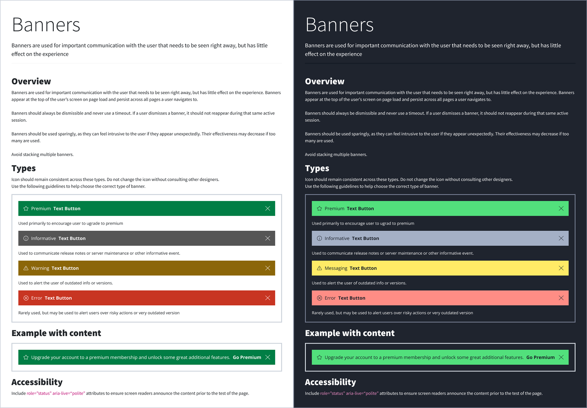
Screenshot from Figma showing banner components in light and dark themes along with usage and accessibility guidance
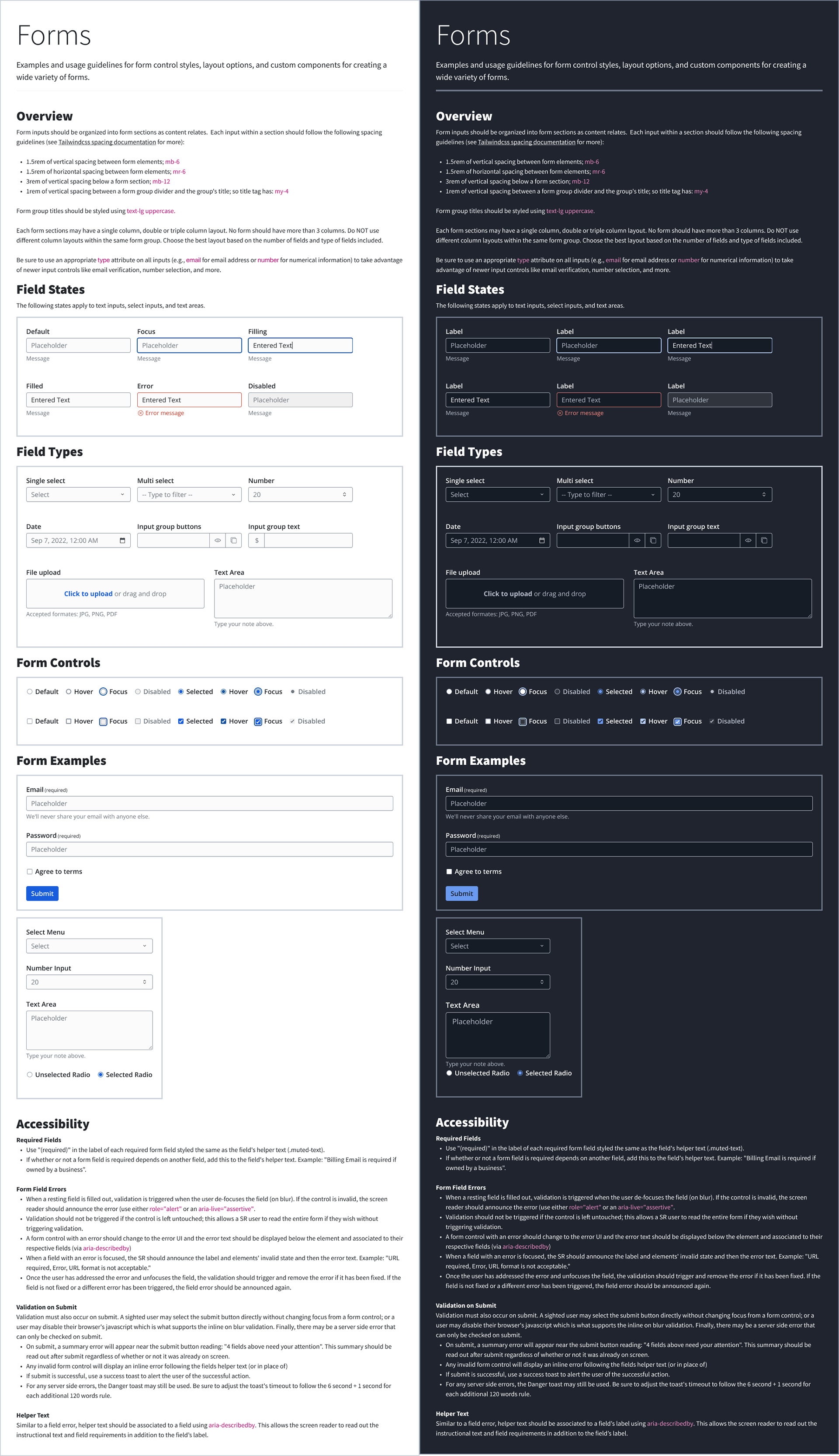
Screenshot from Figma showing form components in light and dark themes along with usage and accessibility guidance
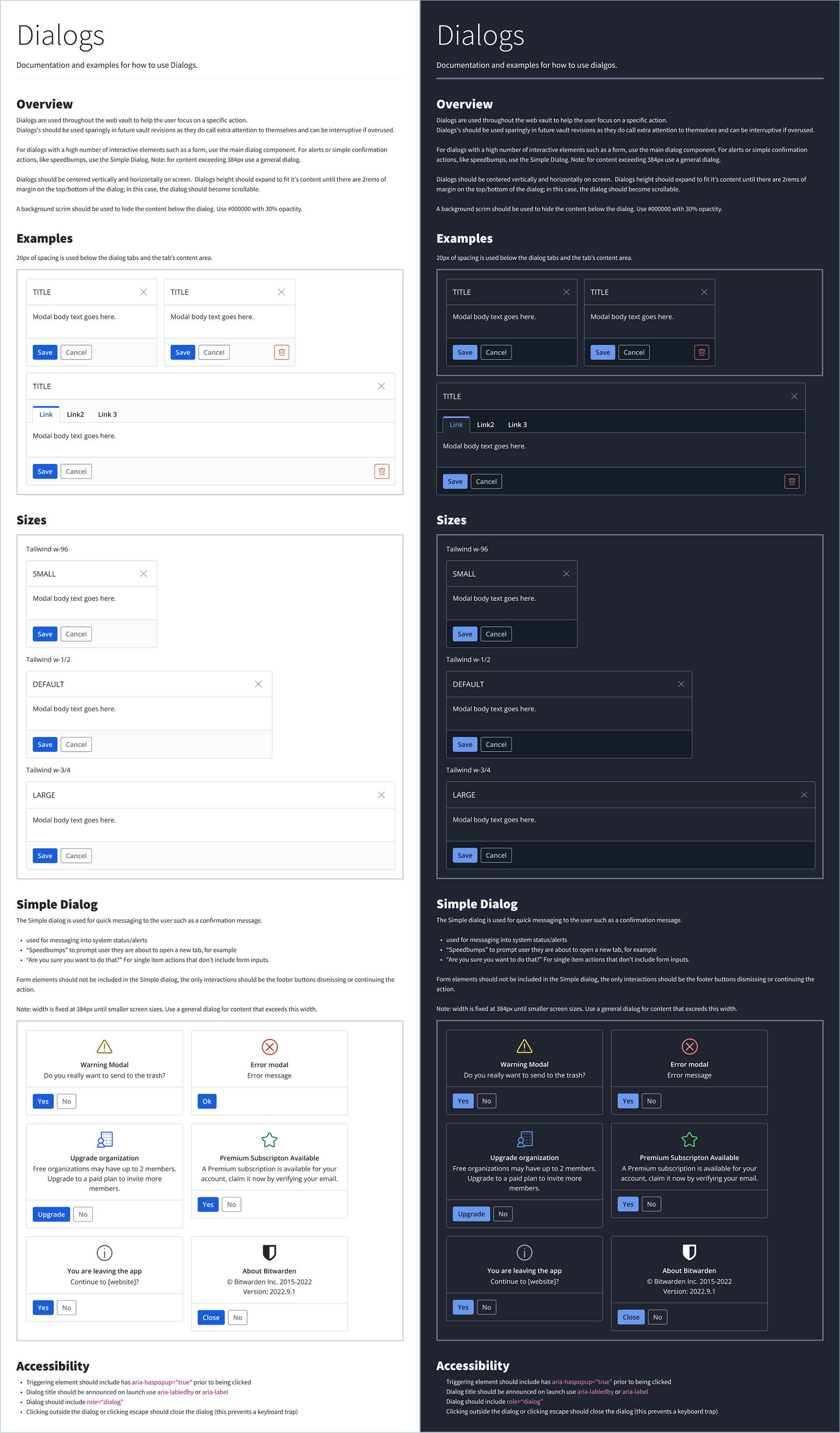
Screenshot from Figma showing dialog components in light and dark themes along with usage and accessibility guidance
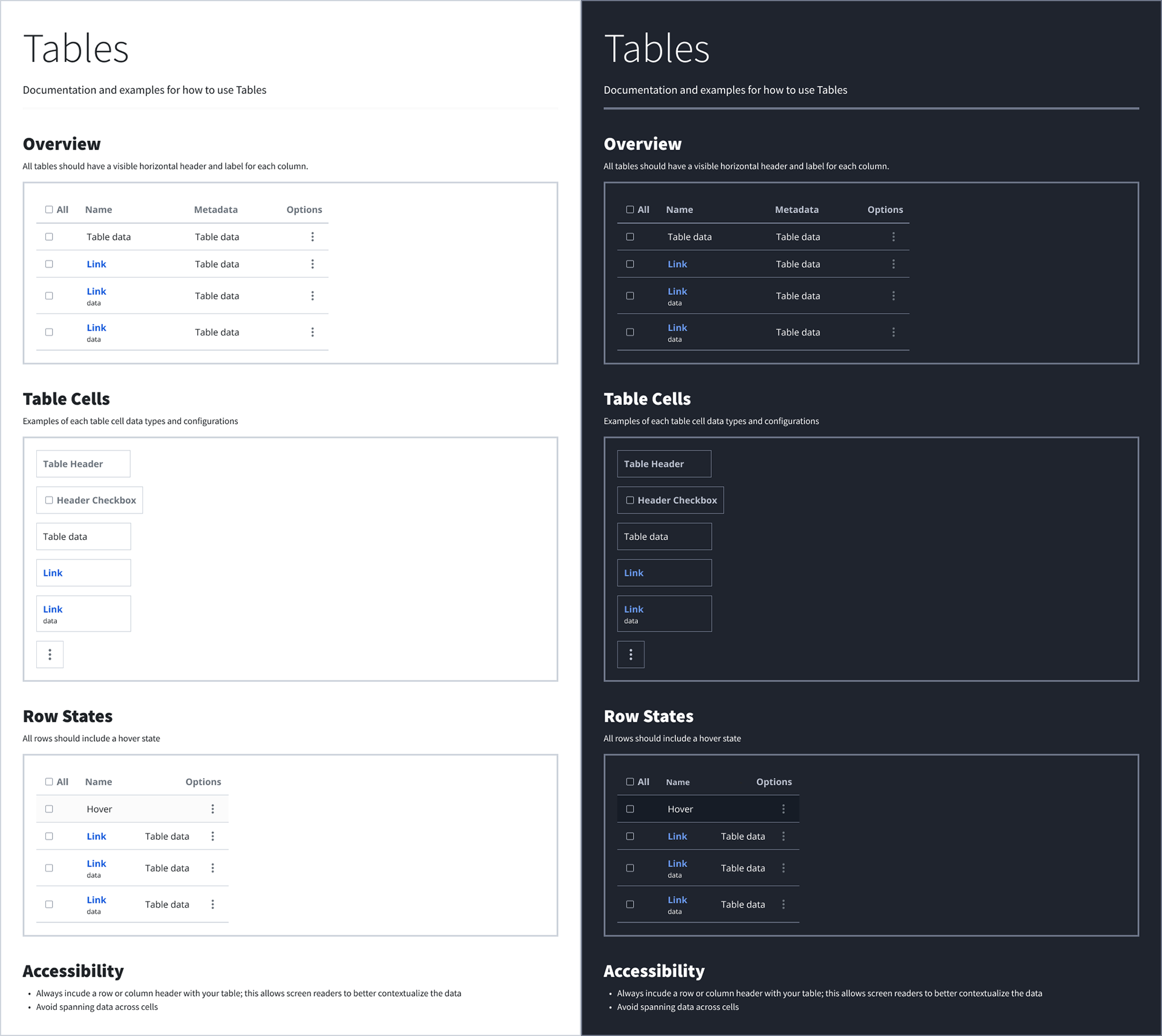
Screenshot from Figma showing table components in light and dark themes along with usage and accessibility guidance
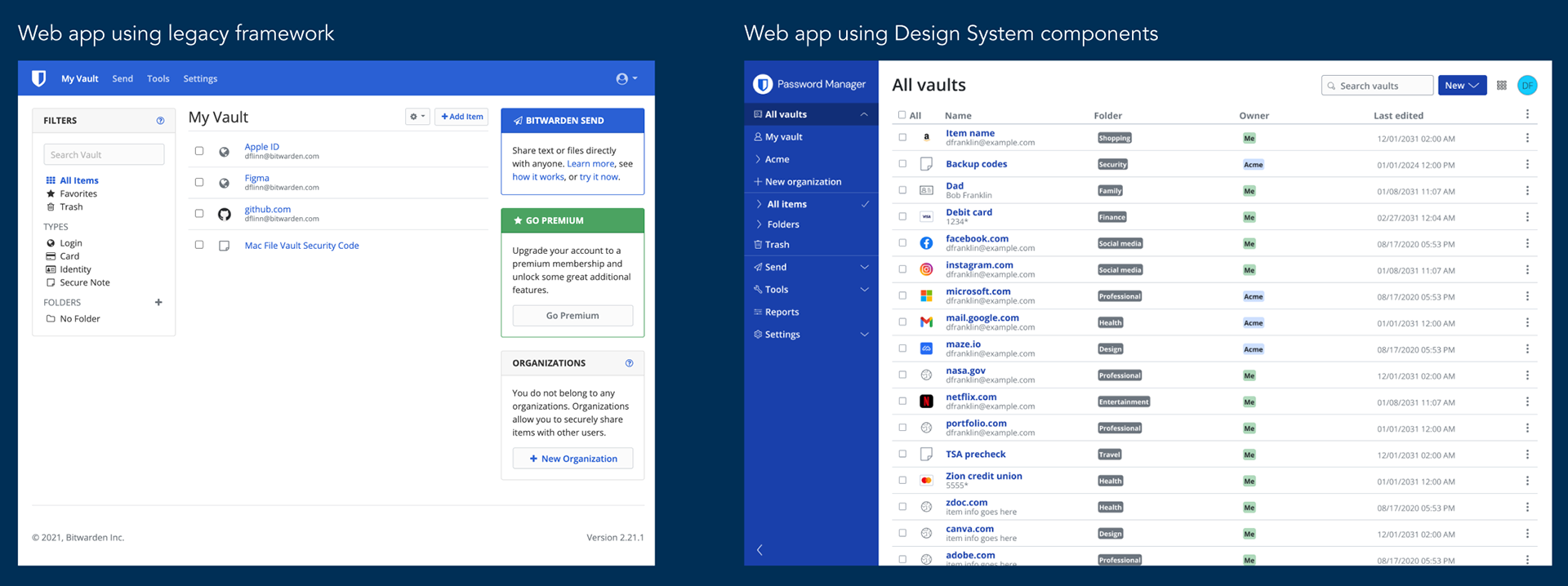
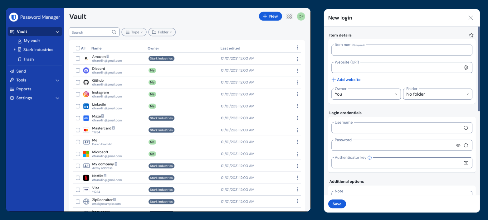
The web app before and after being migrated to the Bitwarden Design System
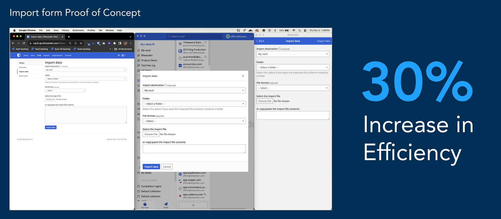
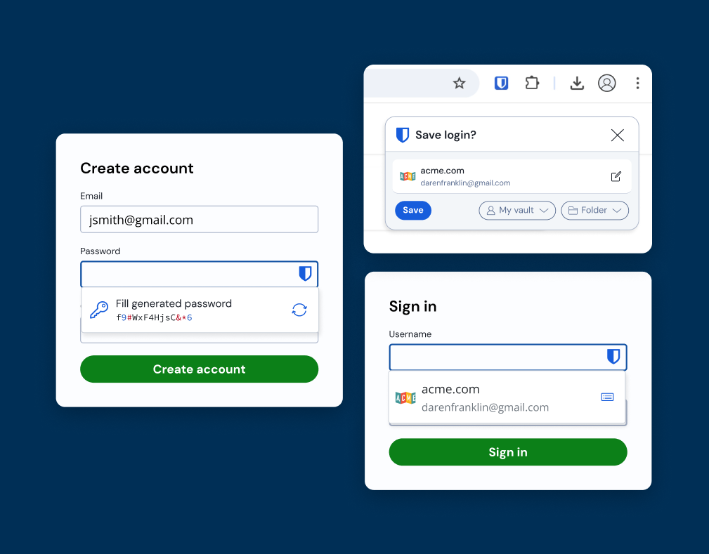
Screenshot showing the import form used in the web app, desktop app, and extension
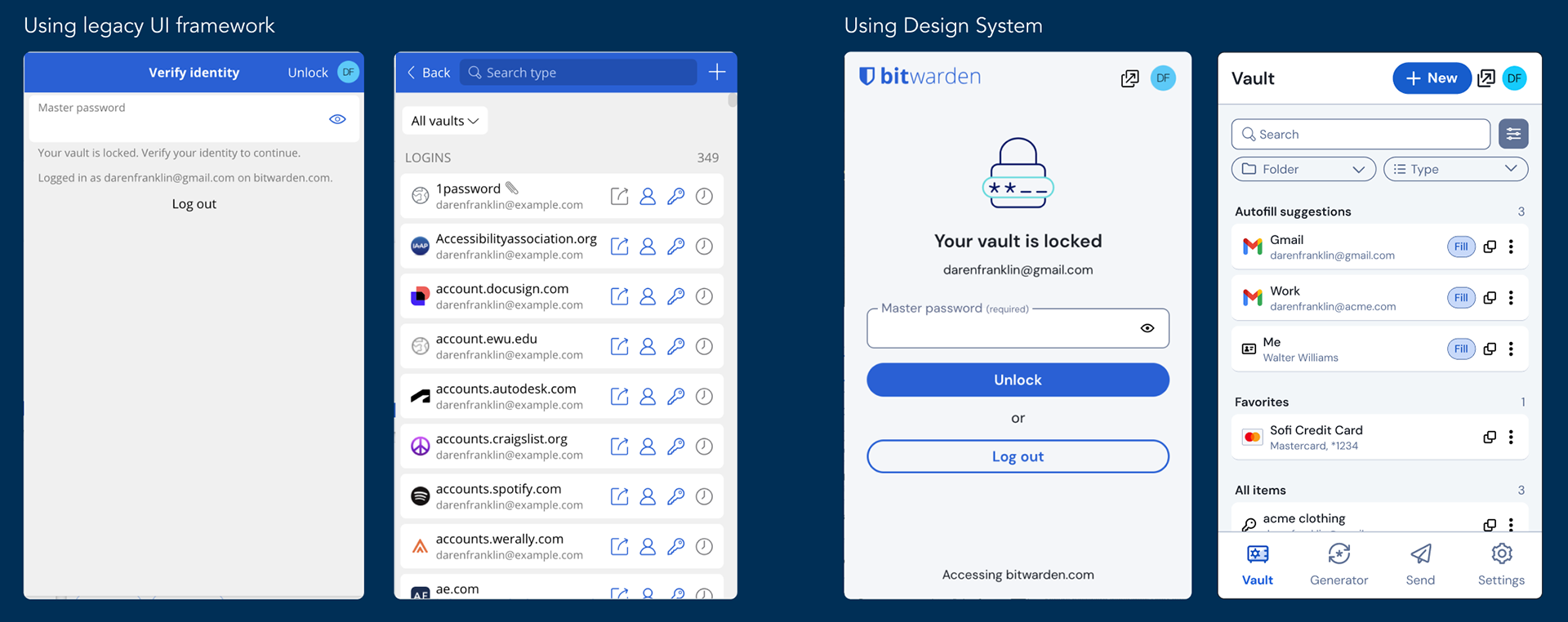
The Bitwarden extension before and after the migration to the Design System
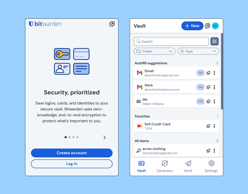
Updated UI components using the new design tokens and styles.
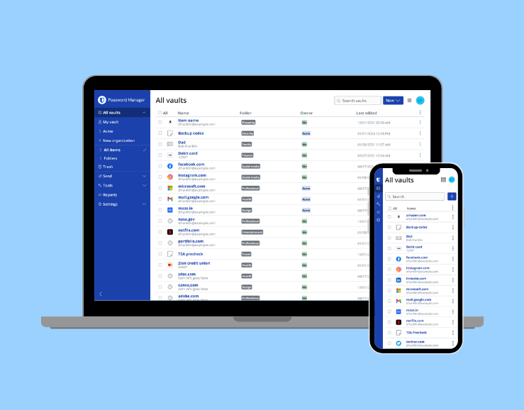
Updated UI components shown on the web application.
Figma concept showing the desktop application migrated to the Design System
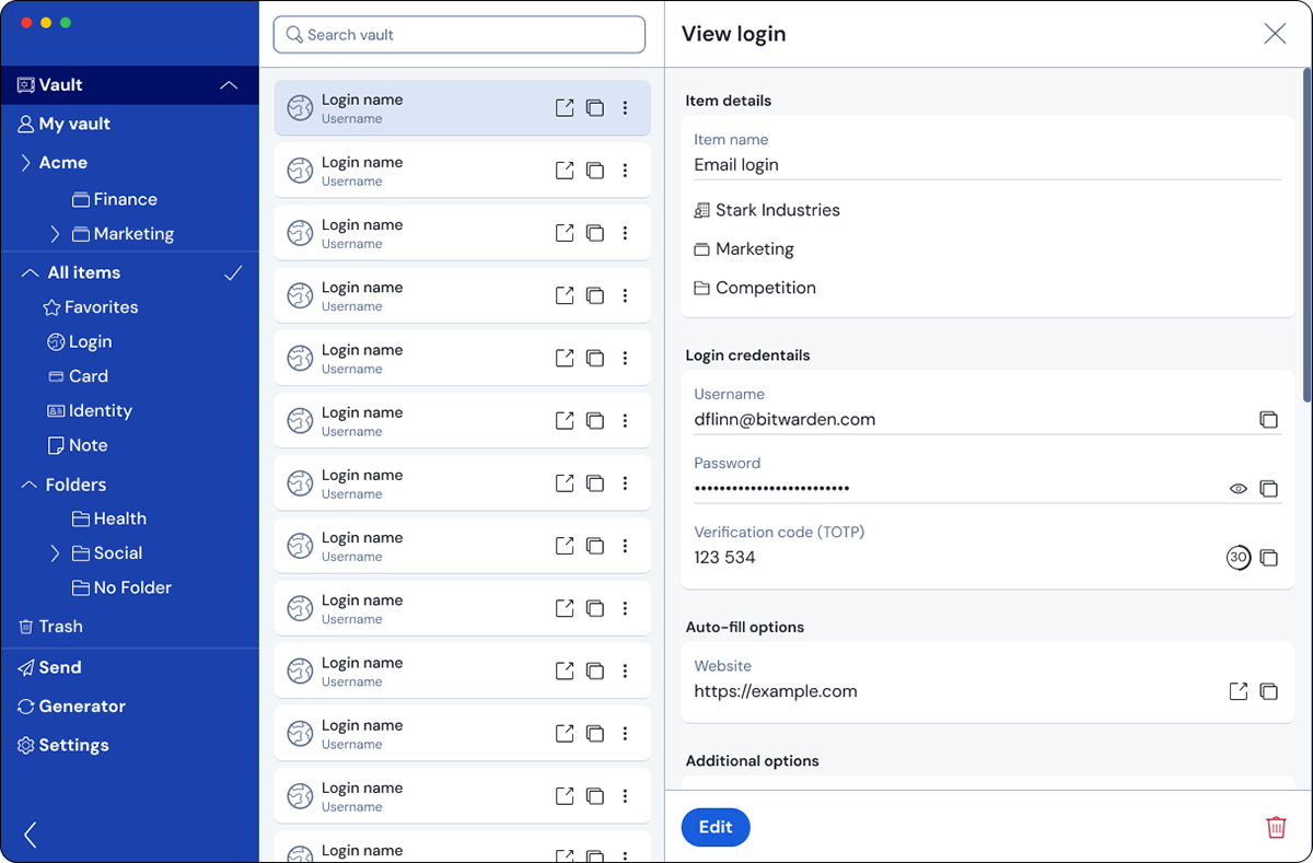
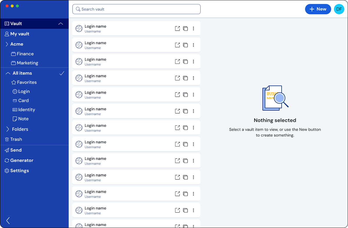
Figma concept showing the View login page in a desktop application update
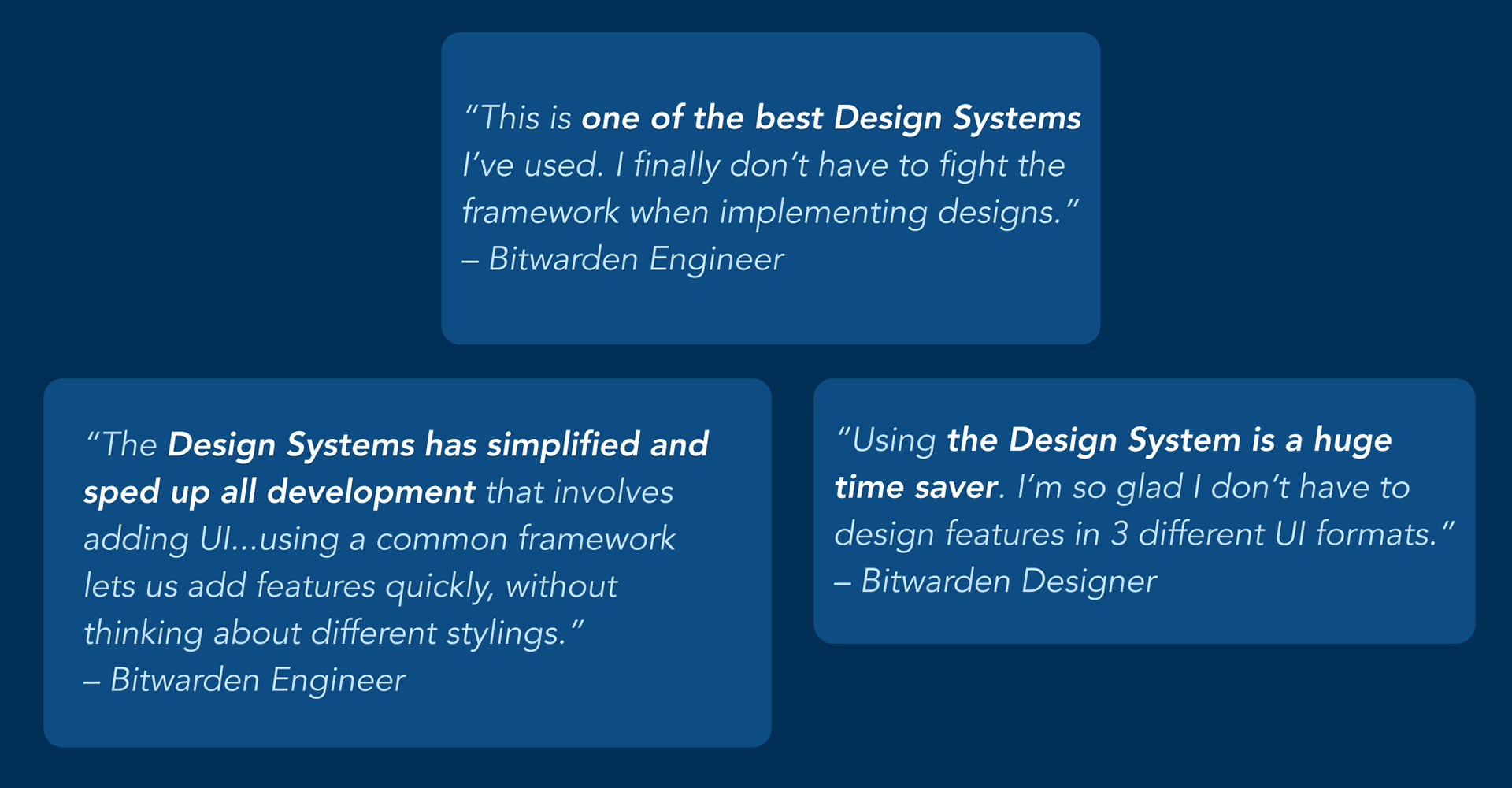
Quotes from Bitwarden employees using the design system.