Background
The Bitwarden password manager extension had several ways for users to save and fill their logins, but they were not discoverable or intuitive to users. This poor experience led many users to abandon the product in favor of competitors.

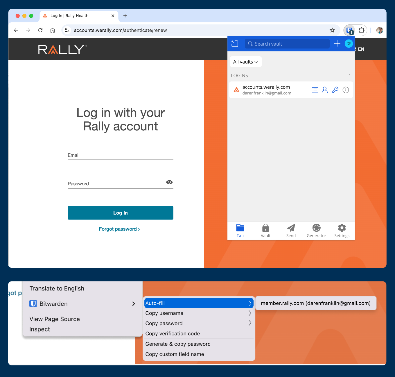
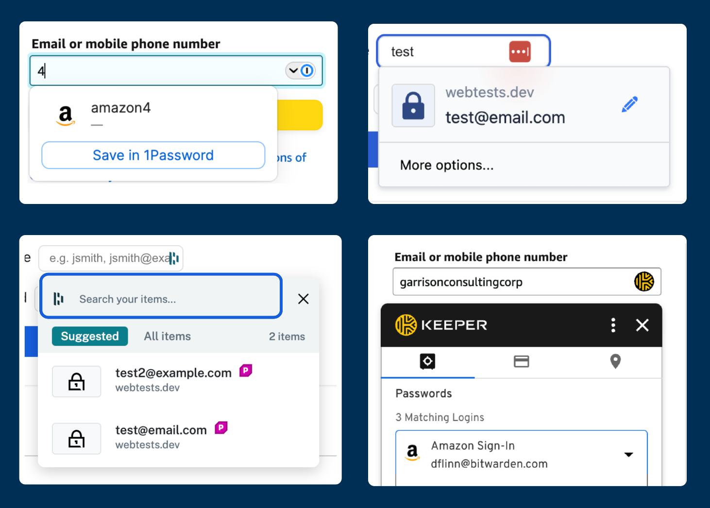
Top: the extension overlay accessed from the browser toolbar outside the login form.
Bottom: the right click context menu where users could also access credentials to autofill

My Role
Led the UX/UI design efforts through discovery research, wireframing, prototyping, user testing, design handoff and support.
Led design breakdown to support continual iteration on the experience delivering user value efficiently.
Collaborated with project management, engineering, and QA to ensure teams understood design requirements and were progressing on implementation.
Presented project updates to stakeholders, taking and integrating executive and cross functional feedback.
Current state of autofill and save
Autofill with Bitwarden
Before this initiative users could autofill 4 different ways:
• Opening the extension and autofill from “Tab” (see image above)
• Using a right click browser context menu (see image above)
• Turning on the "autofill on page load" setting (see image below)
• Using a keyboard shortcut (see below)
These existing autofill methods were not surfaced in the app's core UI leaving users to struggle with moving across the screen to open the extension every-time they needed to autofill.
The most usable options, autofill on page load and the keyboard shortcut, relied on the user discovering these methods in their extension settings within an overwhelming page.
Save to Bitwarden
When it came to saving passwords to Bitwarden, there were 2 workflows users were using; but both had usability issues. 
1.  Fill and submit a form, then select “save” on a Bitwarden prompt similar to the prompt of a built in browser's password manger. 

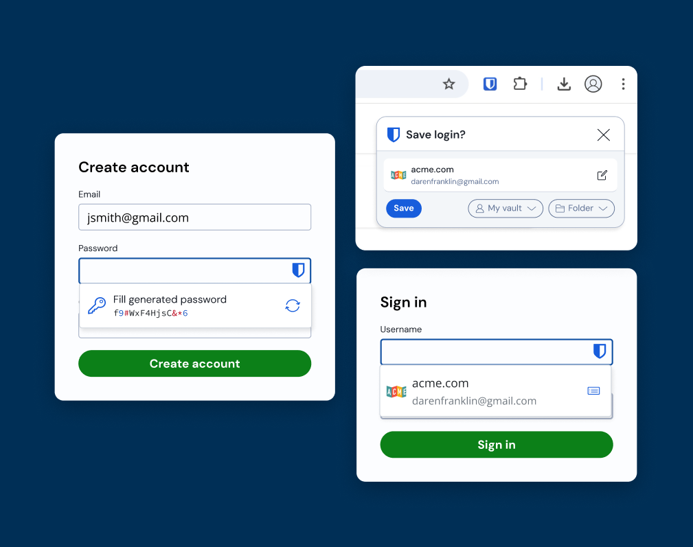
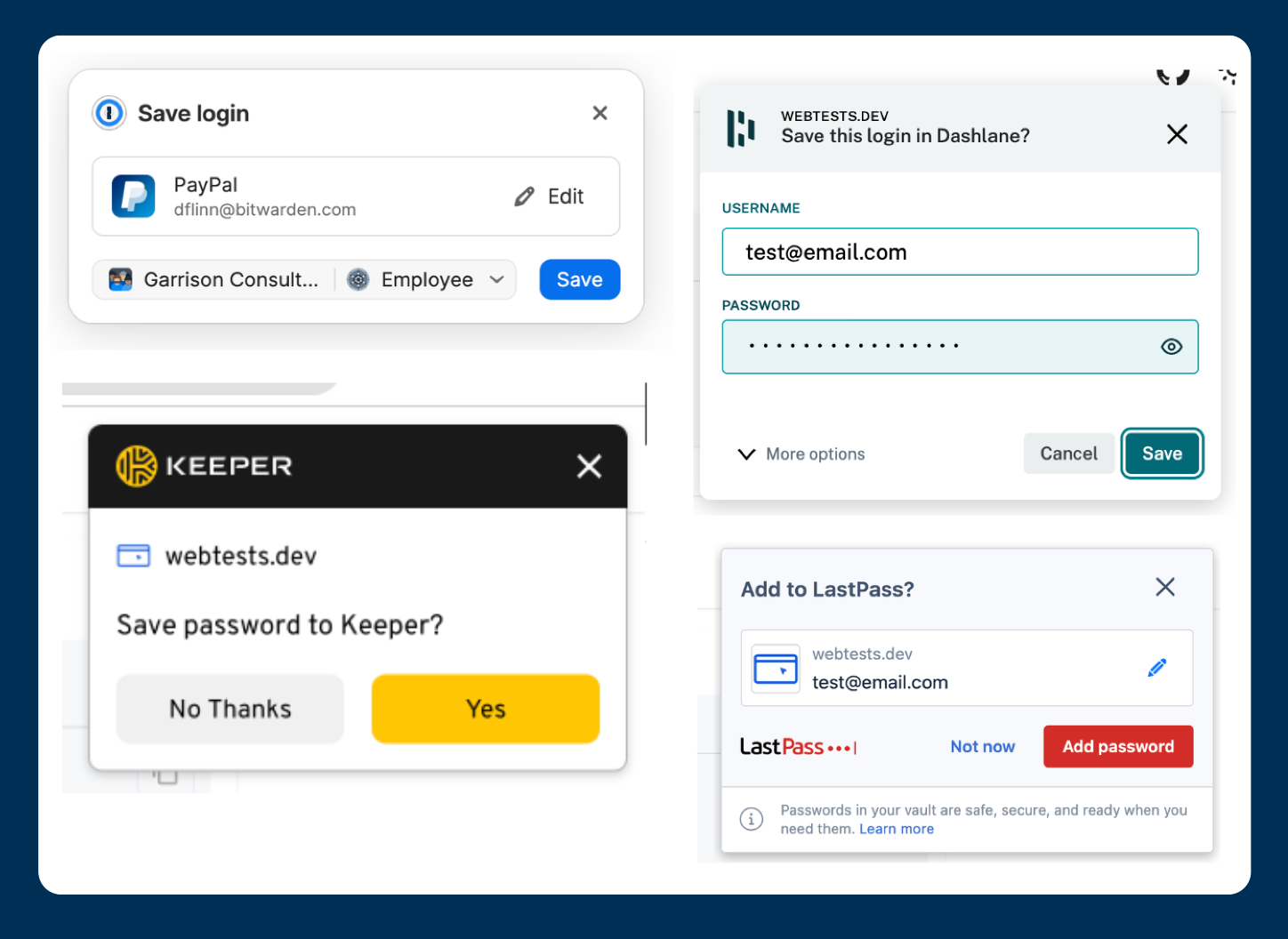
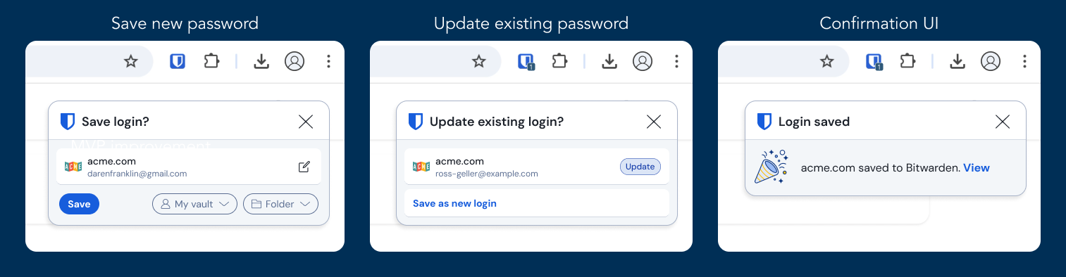
Demonstration of using the save prompt to add credentials to Bitwarden after submitting a create account form.

While this 1st method was usable and intuitive to users, there were gaps:
• After submitting, the Bitwarden notification prompt was not reliable; leading to users creating new accounts within a website's form, and then needing to re-enter the information manually in Bitwarden.
• When the prompt did appear, the placement on the page was often not apparent to users.
• When users did see the prompt, they could became confused by the options presented.
These lead many users to moving toward a work around solution, presented in this 2nd workflow:

2.  Users would create new logins manually in Bitwarden, then they would autofill create account forms with the new login information. 

Demonstration of users manually creating a login in the extension and then autofilling it into a create account from. 

While this was a more reliable flow, it had multiple steps that felt overly complex to users. 
Many users reported it felt intuitive–it did not build on new user's learned behaviors from years of creating accounts and logging into sites directly from a web page.
User feedback
Users often compared the Bitwarden way to save and fill items to competition, citing the simple "autofill menu" in competitors was the only thing they were missing with Bitwarden.
Some even switch away from Bitwarden due to this missing experience.
Competitive analysis
Autofill
All major competitors offered an in page autofill experience similar to the built in browser’s by:
• Showing an icon in field
• Showing matching items within a menu
• Allowing users to select the item without leaving their learned workflow
Saving passwords
All major competitors offered multiple ways to save a new password:
• From their in page menu before submission
• A popup prompt after form submission
This allowed users 2 opportunities to save their passwords–increasing the likelihood that they would complete the vital task.  
Business Goals
Increase user adoption
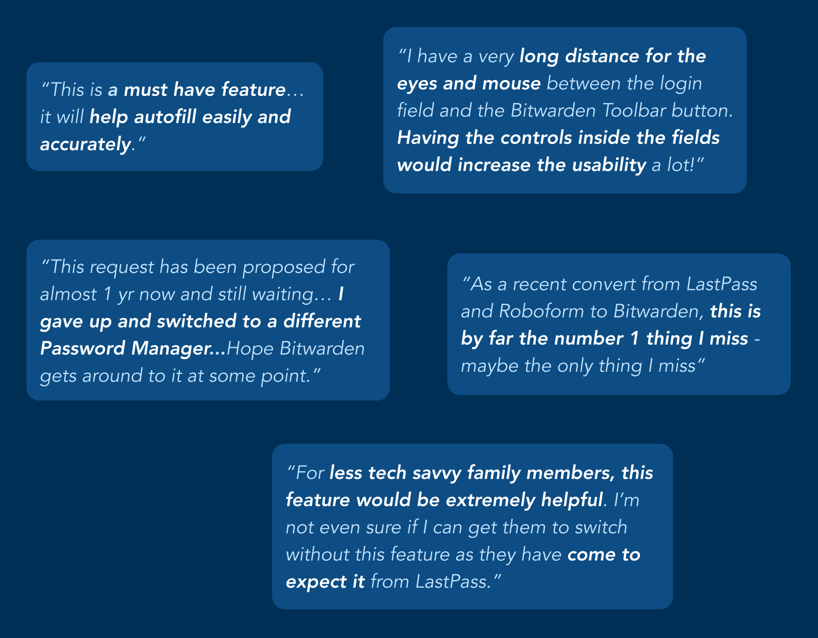
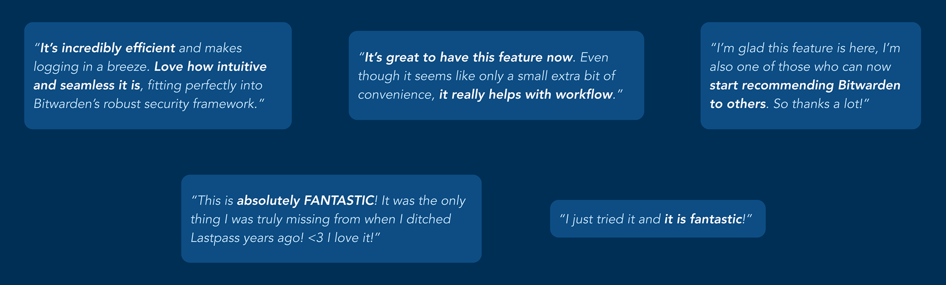
Accelerate when users experience autofill
Reduce user friction
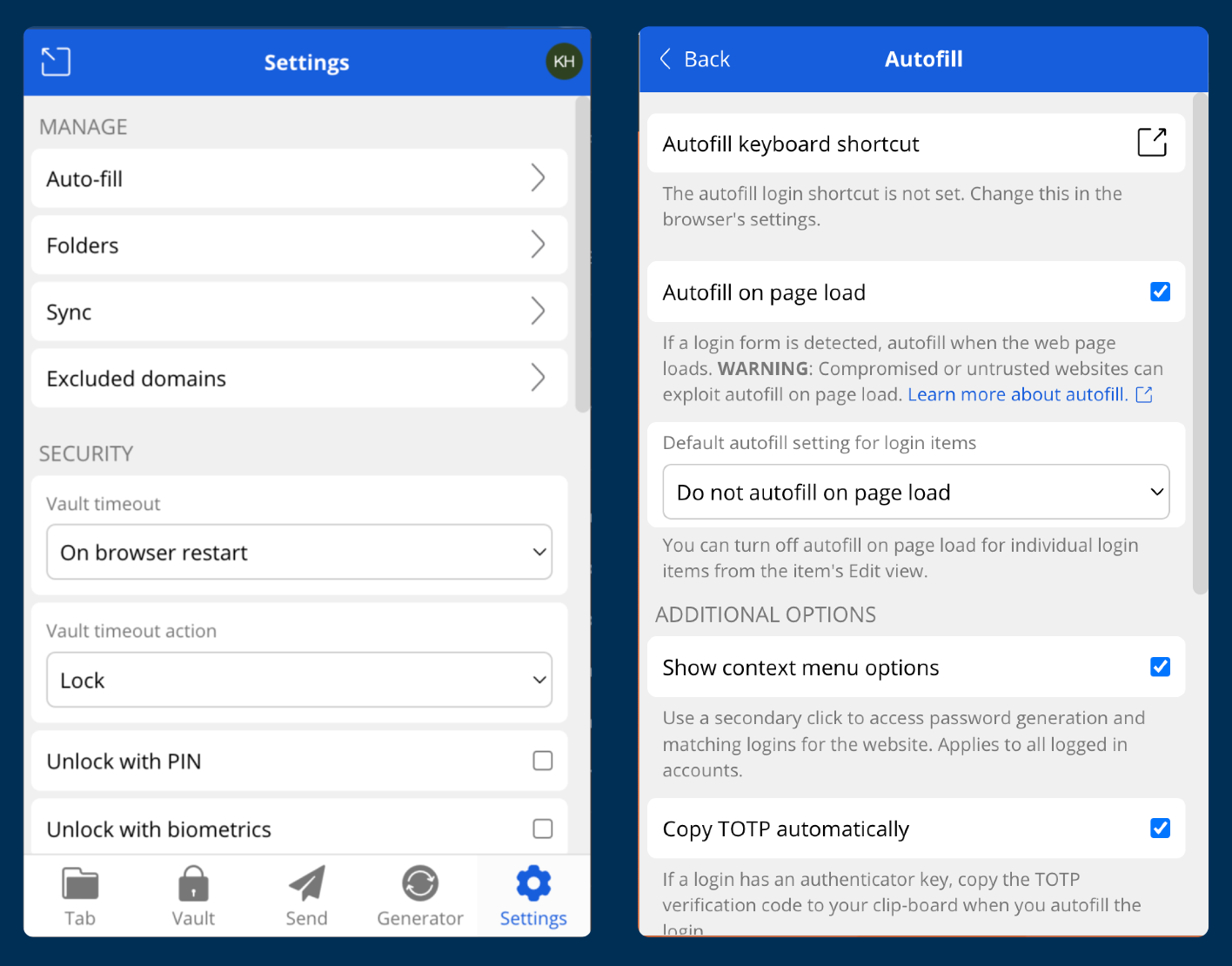
Improve discoverability and usability of save and autofill
Enhance competitive position
Improve approachability of autofill so it is on par or better than competition
Timeline
The project was designed and developed in multiple iterations allowing me to deliver value to Bitwarden users iteratively. 
Q3  2023 – Discovery, concepts, gaining product support, high fidelity MVP prototypes
Q4  2023 – Development, security review, user testing, refinement and release
Q1  2023  –  Project paused due to other company priorities (Chrome MV3 API update)
Q2  2024  – Designing for V2: password generation, autofill for cards and identities
Q3  2024 – V2 development and release, MVP and V2 design for prompt to save messages
Q4  2024 – MVP prompt to save released
Q1   2025  – V2 prompt to save in development
Identifying User Journeys
From the competitive analysis and user feedback, I ideated all possible user journeys I expected users would want to see in this feature. 
From the brainstormed list, I prioritized each feature based on the value it would deliver to the user.
This resulted in the following primary user journeys:
• Logging in to a website
• Creating a new account on a website
• Saving a new password to Bitwarden
• Updating an existing password in Bitwarden
• Filling out payment or billing forms
Prioritizing User Journeys
The initiative's Product Manager and I aligned on focusing the MVP work on the core need: autofilling credentials when signing into a website
I then identified the UI states I would need to design for and mapped these to a userflow:
• Account unlocked (happy path)
• Account locked
• Nothing saved for website

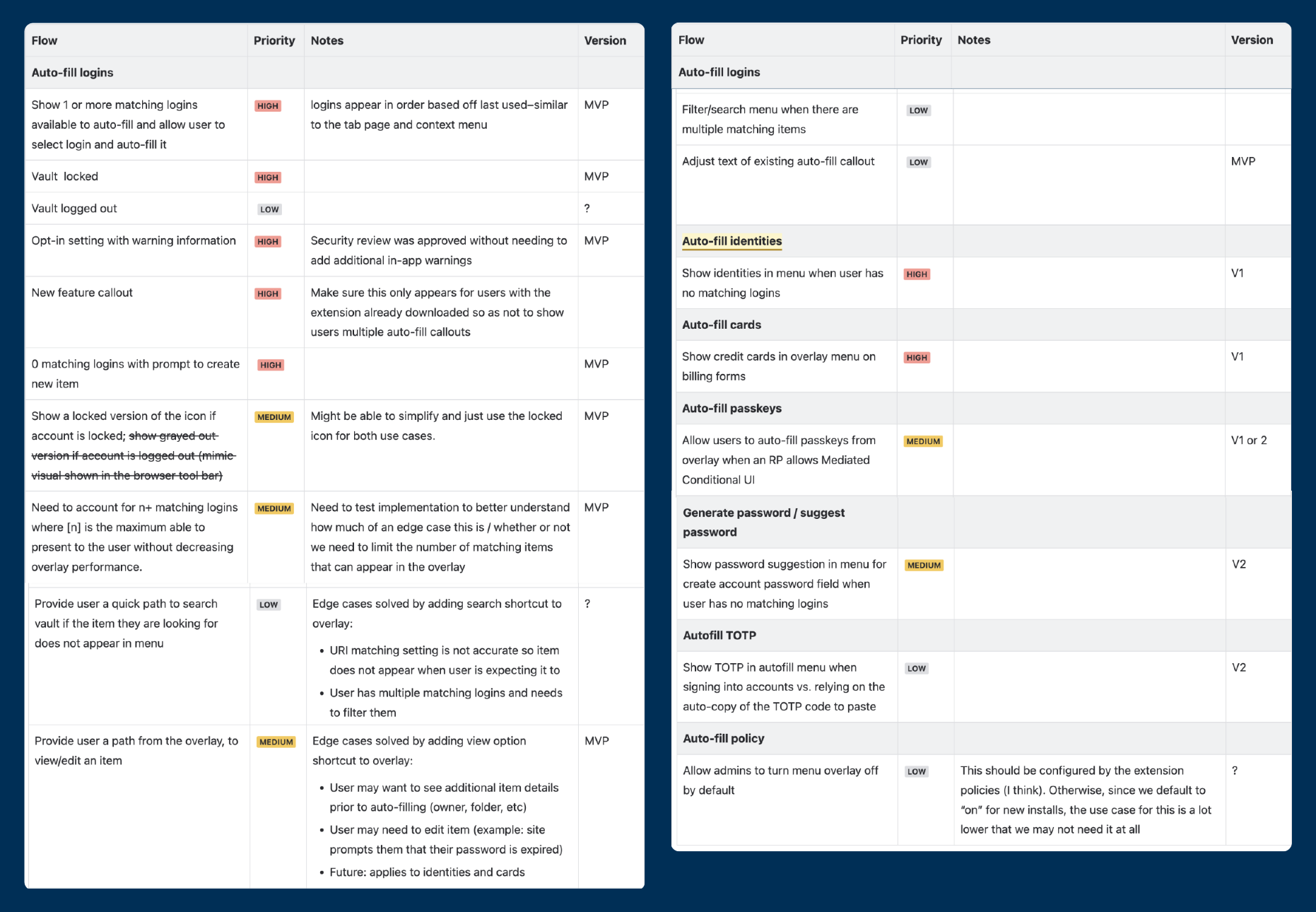
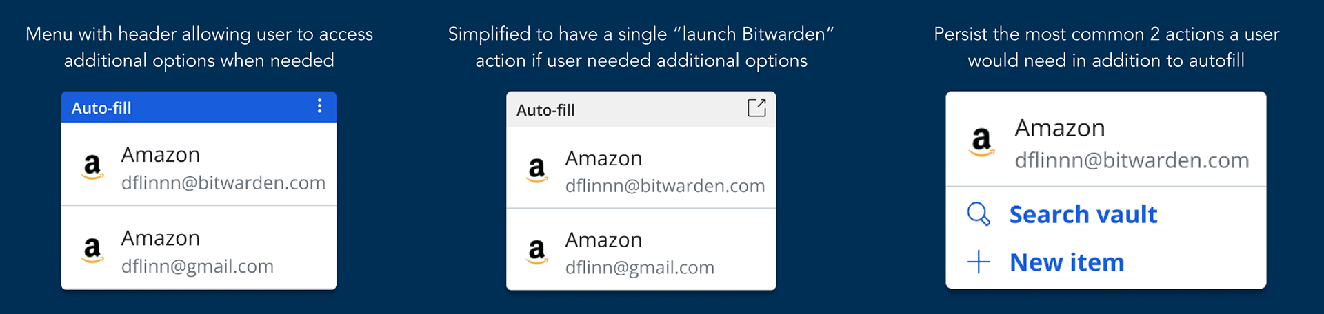
I identified 2 opportunities to improve the MVP further if development capacity allowed:
• Prompt to save a new account in Bitwarden when nothing is saved
• Option to quickly launch an item's details of matching items
UI Iteration
The first set of UI iterations focused on trying to create a framework that could scale to support the additional features identified in discovery. Ultimately, I realized these ideas muddled the UI and I needed to define a simpler experience to support that core user journey I'd identified. 
Final Direction
The final design direction took a simpler approach to focus on delivering the key action for autofilling log in forms as clearly as possible
While still allowing for additional functionality to be built upon it in followup releases.

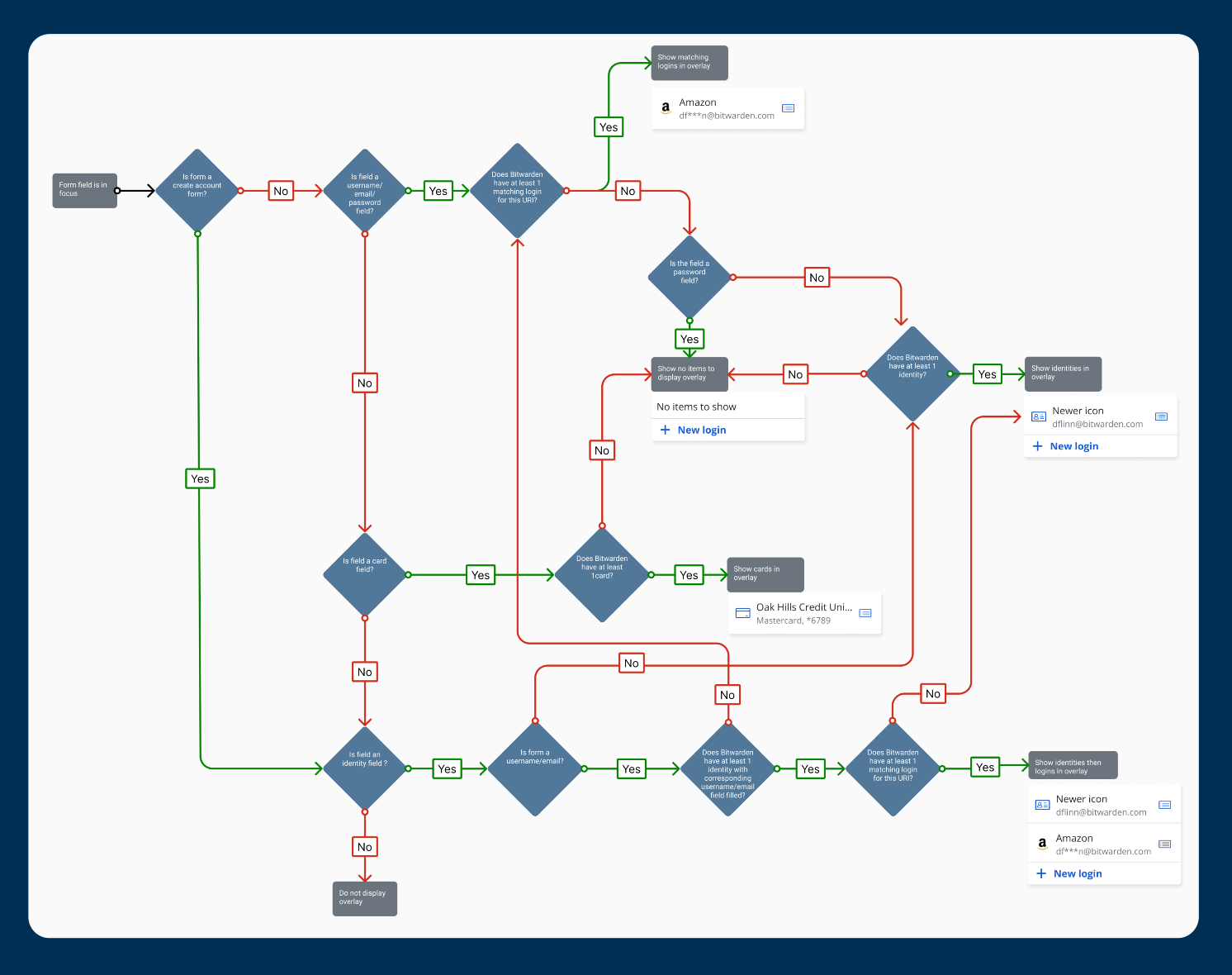
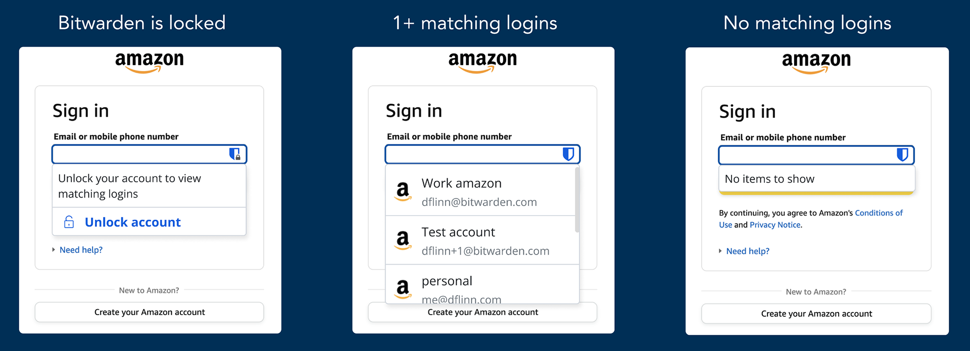
Initial MVP autofill menu design showing the 3 UI's needed: account locked, matching logins, and no matching logins

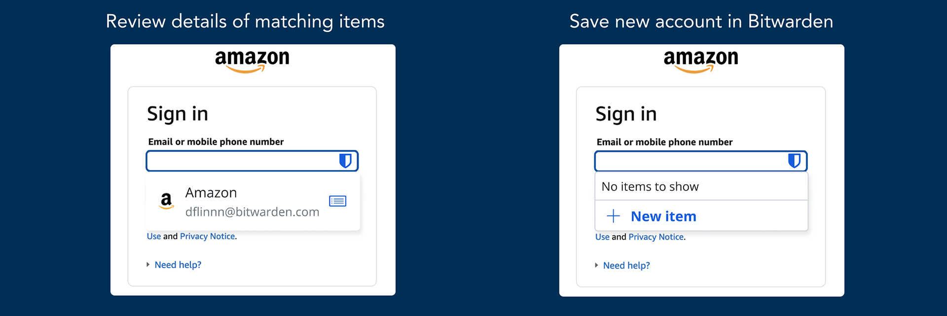
The final MVP released to users showing a "view details" quick link icon button and a prompt to create a new item in Bitwarden when there are no matching logins

Expanding Autofill
While the development team built out the experience for the login flows I continued designing for the V2 user journeys:
• Filling out contact information in registration or billing forms
• Filling out payment information in billing forms
• Creating strong unique passwords to autofill registration forms

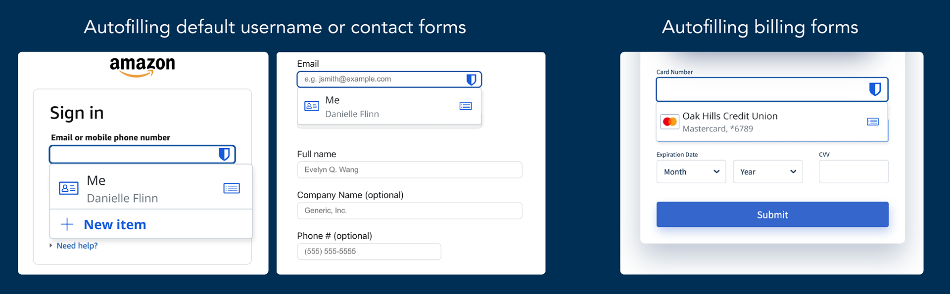
V2 designs for autofilling identities (contact information) and payment methods

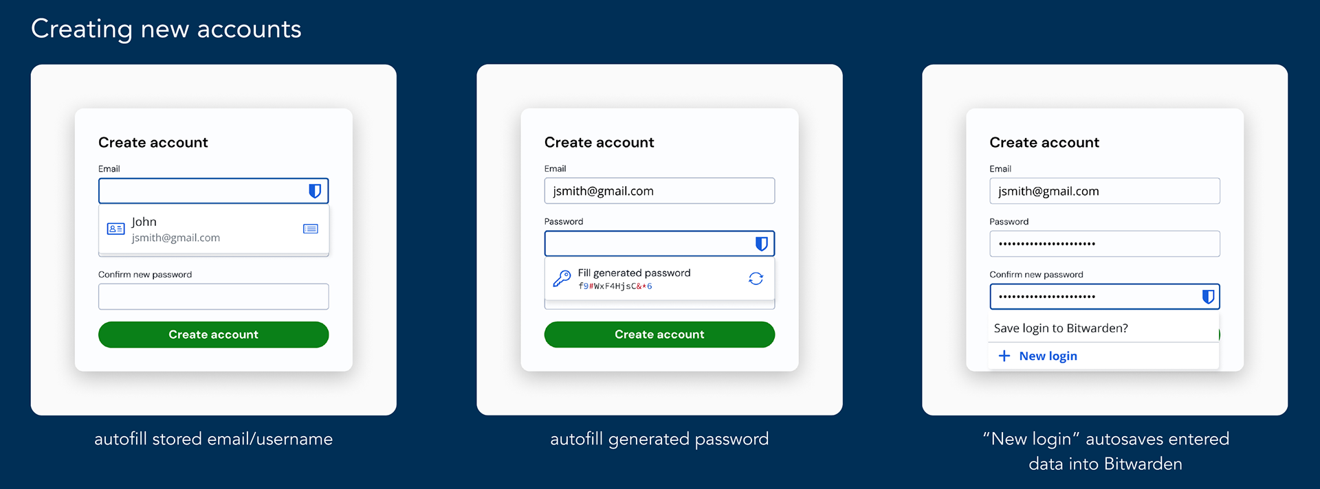
Userflow for creating a new account on a website using the new V2 inline autofill of contact information and password generation

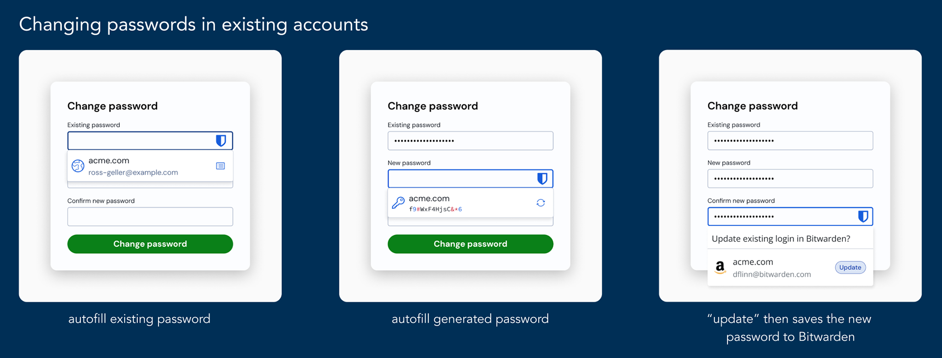
Userflow for updating passwords using the new V2 inline password generator 

User Testing
I conducted user testing with an early development proof of concept, while the engineering team wrapped up a security review and final bug fixes. Testing with the actual product allowed me to get accurate insights from the experience to help drive further improvements. 
Research Goal
Establish baseline metrics for how usable the autofill experience is and gather insights to drive additional iterations.

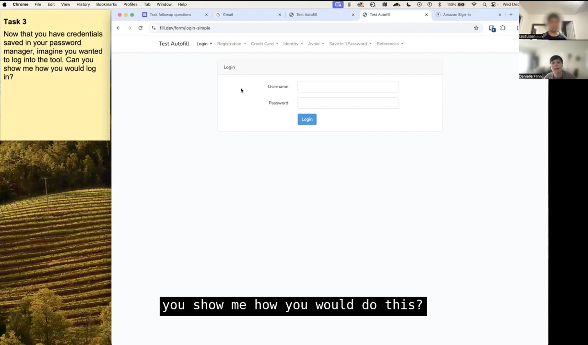
Screenshot of a user testing session right before they discover the autofill menu

User Testing Tasks:
• Turn on the feature
• Create a new account & save
• Sign in/autofill a new account
• Save an existing account’s credentials
• Identify correct email from 2 matching logins
• Autofill with account locked
Testing Results
The test results showed a System Usability Score (SUS) rating of 88 for the Bitwarden autofill experience–higher than the industry average (68).
Insights to improve autofill menu:
• Users reported turning on the feature was cumbersome and expected it to be on by default. Providing me with data to support my request to release the feature on by default for new users. 
• The obfuscated email, (requested by security team) caused friction when multiple items matched a website. Providing me with data to educate the company on the impacts of the security precaution.
Insights to improve save prompt:
• Users often missed the prompt 
• Users reported the options presented in the prompt were confusing
• User saving with the prompt were unsure if the password was actually saved
Applying Results
MVP Save to Bitwarden Prompt
Insights from user testing helped drive additional improvements, including a redesign of the save and update prompts. Based on the testing results I knew I needed to: increase the reliability, visibility, and clarity of the prompt and improve user's confidence in it. 
To keep the scope low and deliver value quickly, I focused on making small changes to improve the experience, resulting in:
• Increased visibility of the prompt by updating the placement of the prompt into a more intuitive location–the top right to match competitors and built in browser notifications. 
• Improve user confidence in the product by adding confirmation messaging after a successful save
• Increase the reliability of the prompt through technical improvements to when it is triggered
Redesigned Save to Bitwarden Prompt
While the MVP update resolve much of the user friction identified, it did not resolve the unclarity of the options presented in the UI. For resolving this issue, a UI update was prioritized. 
This full redesign updated the visual look and feel to highlight primary actions better, and matched more modern design principles now in use throughout the extension's pages. 
The redesign also created a more scalable experience that Bitwarden planned to use for additional enterprise features. 
Bringing all the improvements together, in the video below I show the full user journey for creating and saving a new account to Bitwarden:
• Using the autofill contact information to fill the email field 
• Using the password generation feature to fill a strong password
• Using either of the "save to Bitwarden" prompts to save to Bitwarden
• Displaying the confirmation UI to improve user confidence and delight 

Demonstration of a user creating a new account using the Bitwarden autofill and save features 

Impact
This initiative greatly improved autofill discoverability, usability, and user satisfaction. Users responded overwhelmingly positive to the initial launch of the autofill menu and the followup work.  
Demonstrating how investing in user experience leads to sales expansion and improved retention, as improvements made during the project empowered the sales team land a large enterprise deal. 

More of my work

Back to Top