
Background
The Bitwarden password manager extension had complex interactions and outdated UI creating a reputation that Bitwarden was “too technical”. This negatively impacted product adoption, retention and overall user satisfaction––ultimately making it difficult to sell Bitwarden.
My Role
Led the extension redesign efforts through discovery research, wireframing, prototyping, user testing, design handoff and support
Led design for integrating UI changes into the design system so all interfaces would benefit from the modernization efforts
Collaborated with project management, engineering, and QA to ensure teams understood design requirements and were progressing on implementation
Presented project updates to stakeholders alongside Director of Product Design, taking and integrating the executive and cross functional feedback
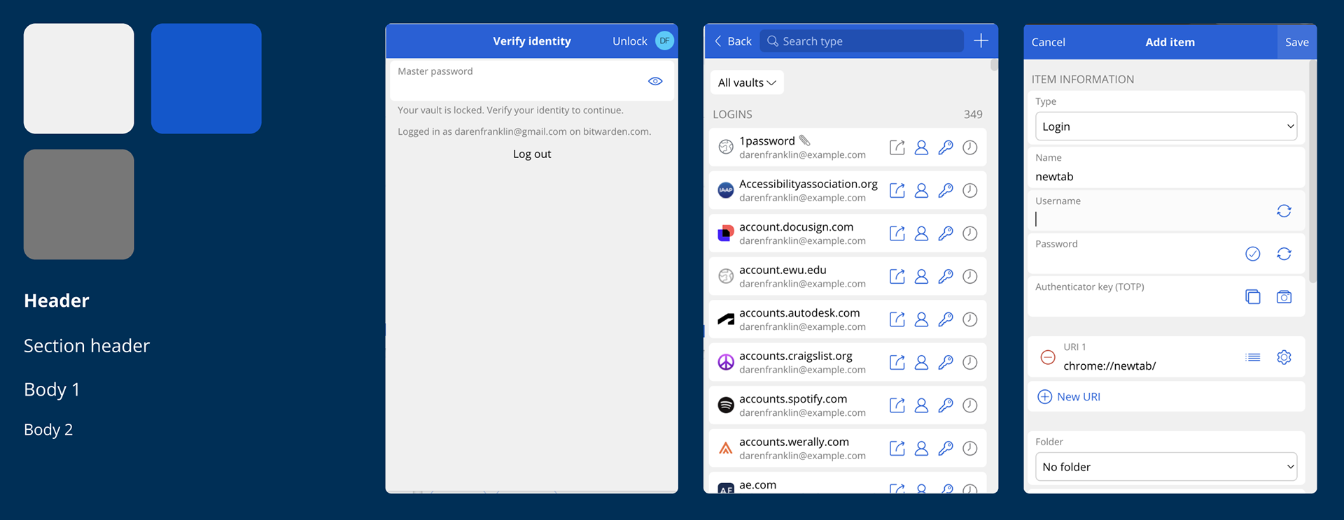
Heuristic Analysis
To better understand the gaps in the existing interface, I completed an heuristic analysis. After completing the analysis across all pages, I found that the interface had:
• Outdated visual design
• Poor visual hierarchy
• Inconsistent interactions
• Unclear iconography and labels
• High friction in key tasks
• Poor visual hierarchy
• Inconsistent interactions
• Unclear iconography and labels
• High friction in key tasks
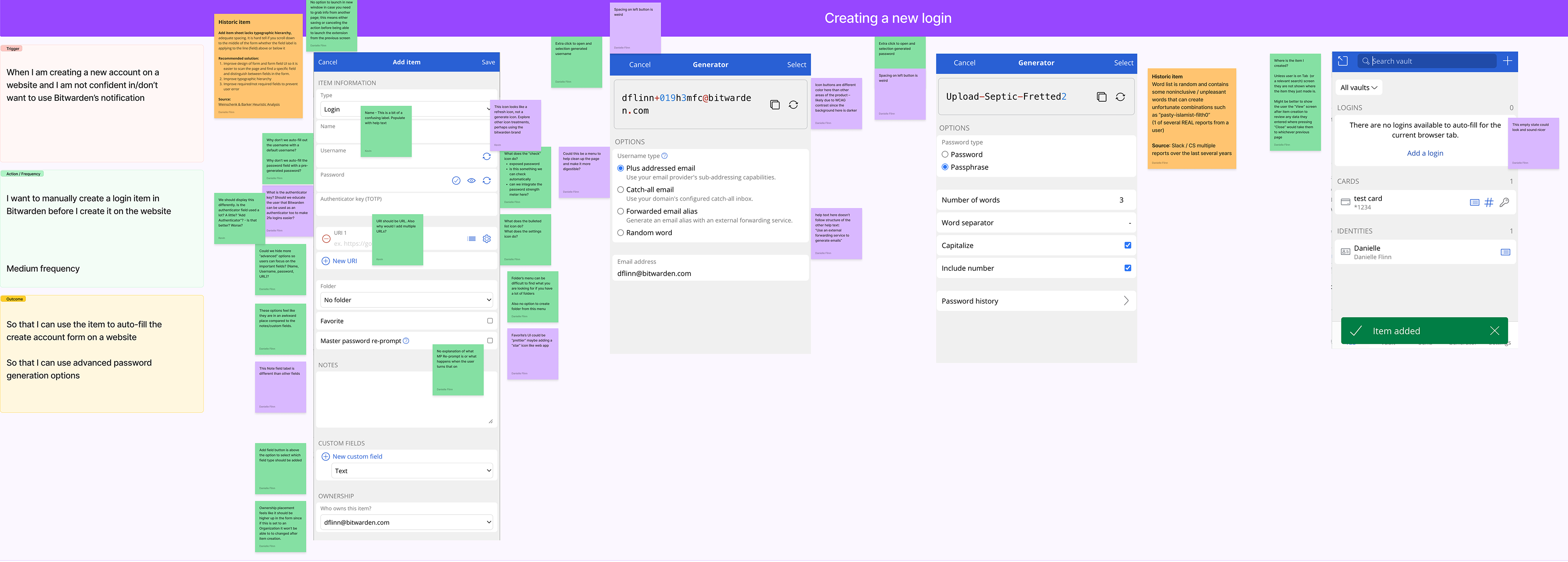
A FigJam board showing screenshots of the extension interface with sticky note annotations of improvements
Additional Research
To gather more insights and understanding, I:
• Reviewed internal reports
• Consolidated relevant community feature requests
• Analyzed user sentiment in social forums
• Conducted user testing with new and existing users
• Consolidated relevant community feature requests
• Analyzed user sentiment in social forums
• Conducted user testing with new and existing users

Business Goals
Reduce user friction
Re-design for clarity and emphasize key elements
Re-design for clarity and emphasize key elements
Simplify User Onboarding
Guide users to accelerate product familiarity
Guide users to accelerate product familiarity
Enhance competitive position
Create a positive, modern, and approachable perception of Bitwarden
Create a positive, modern, and approachable perception of Bitwarden
UX Goals
To meet the project goals, I set out to:
• Create a recognizable experience by aligning the UI with the Bitwarden Brand matching fonts, colors, and spacing
• Elevate core features and make primary actions more prominent in the user interface
• Scannable and easy to navigate by visual grouping related content and updating spacing
• Streamline user interactions by simplifying complex interactions and consolidating repetitive UI
• Make concepts more approachable by clarifying text labels to be human readable and consolidating repetitive language
• Increase the accessibility of the interface through improving color contrast, labeling, semantic structures, and interface customization.

The evolution of early UI concepts using existing design system components
Timeline
The project took a full year to design and implement.
Q1 – Discovery, early concepts, and gaining executive support
Q2 – High fidelity prototypes, user testing, refinement, and handoff
Q3 – Design support for the design system team and feature teams
Q4 – Beta release, user reaction, and followup improvements
Q4 – Production release, user reaction, followup improvements extending to next quarter
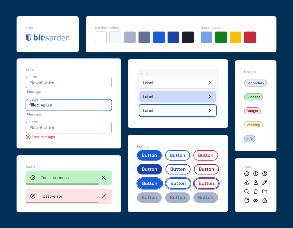
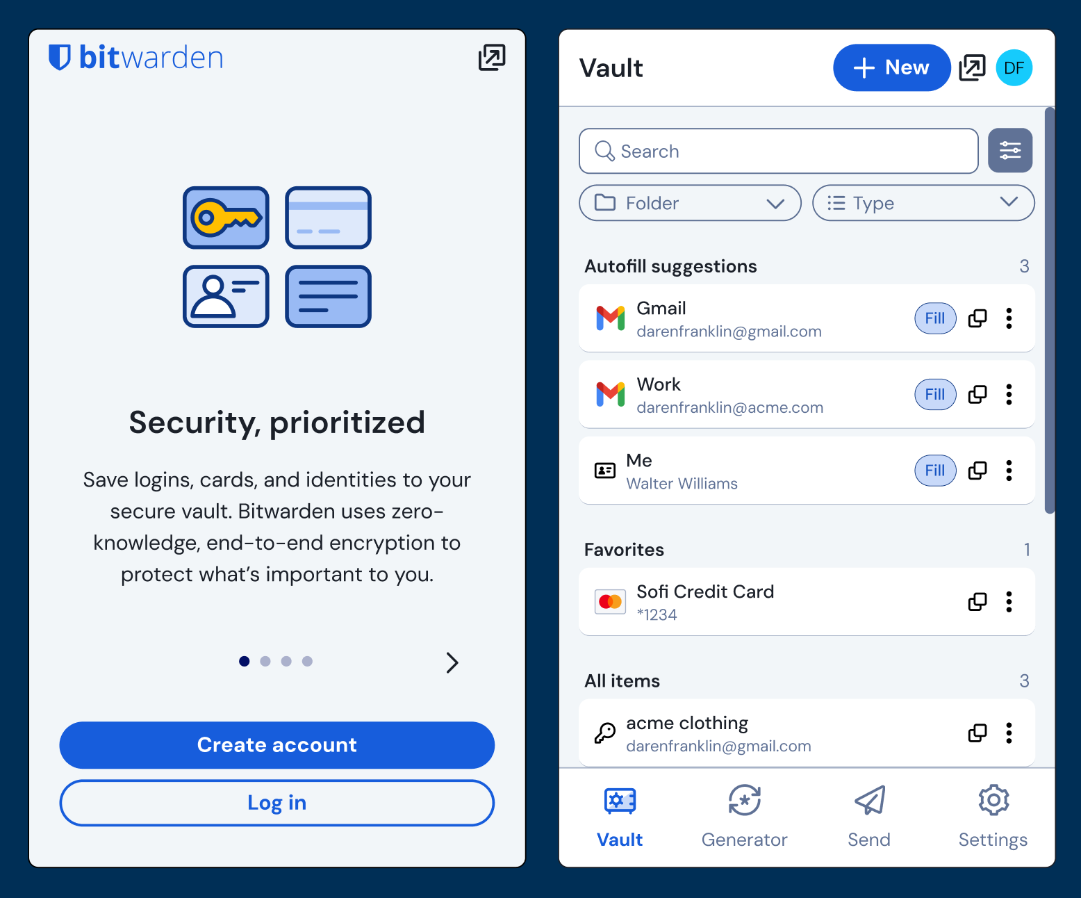
Legacy Design Tokens
The legacy design tokens were flat and made the interface feel outdated.
The limited text styles made it difficult to bring hierarchy to the interface.
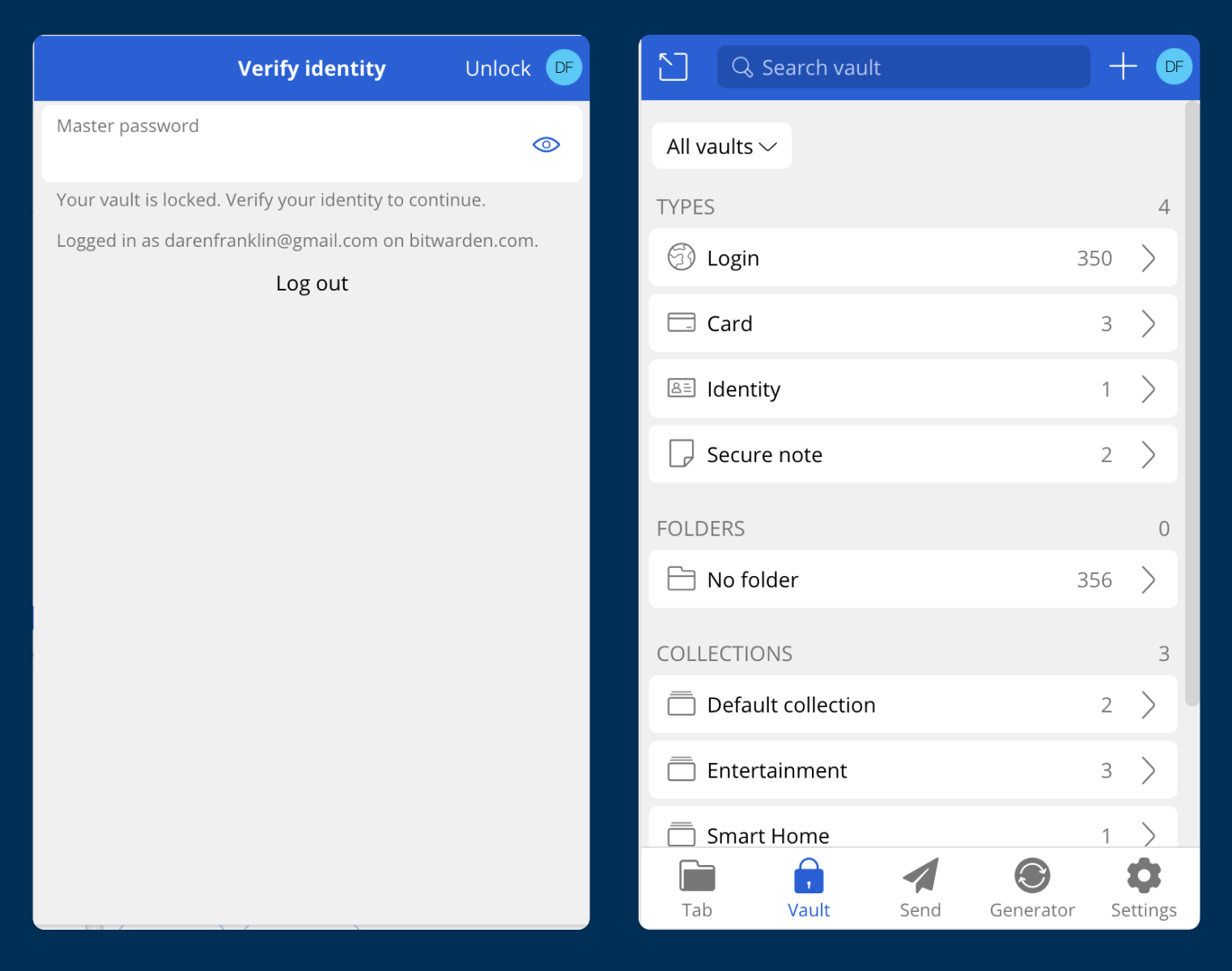
New Design Tokens
The updated colors and fonts reflect more of the brand, header styles added new hierarchy to the interface, and increasing the border radius across elements resulted in a more friendly and welcoming interface.

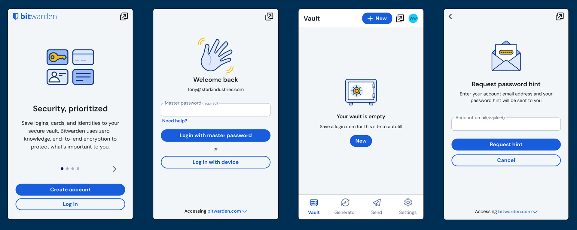
Updating Content Organization
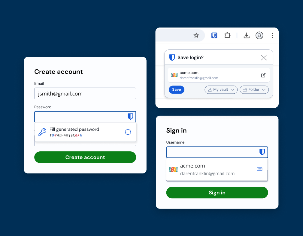
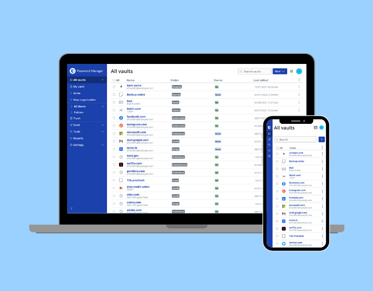
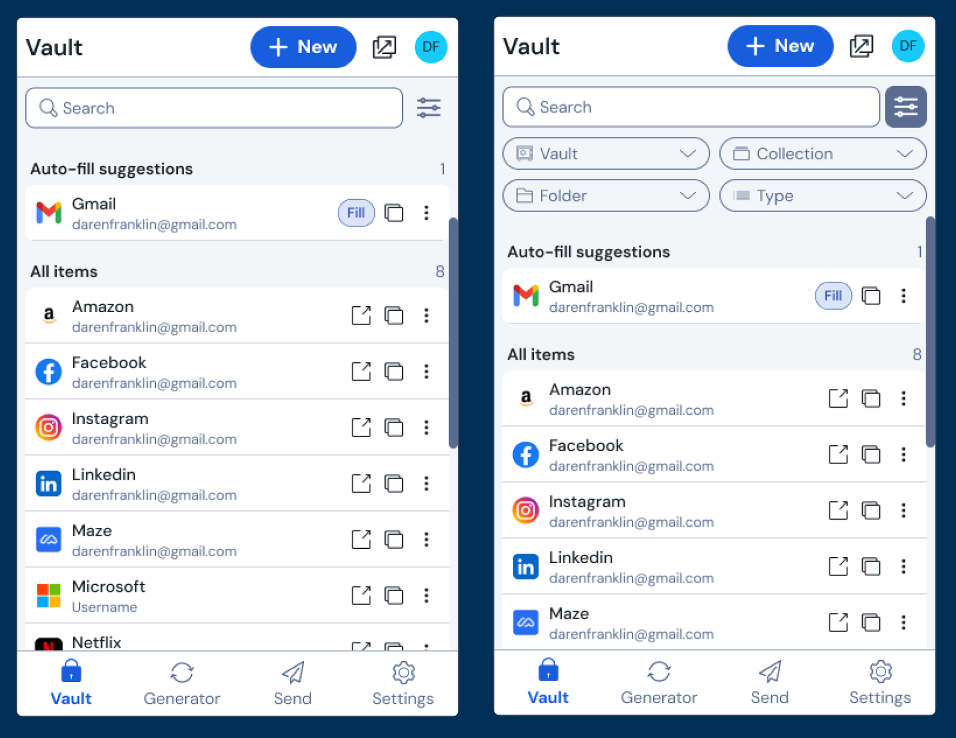
One of the main changes in the design was in the navigation. The Legacy extension UI had 2 pages for users to interact with their passwords: the Tab and Vault page.
This division of content often confused new users–especially when the context would automatically update when searching. As a result, the new design consolidates these pages into a single view with embedded filter options
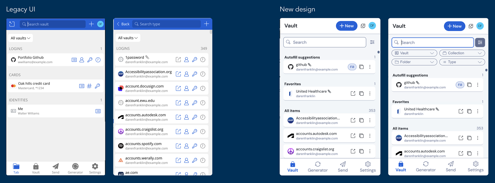
Throughout the rest of the application, I organized each pages' content into labeled sections to create more visual hierarchy, highlight key elements, and ultimately make each view more scannable
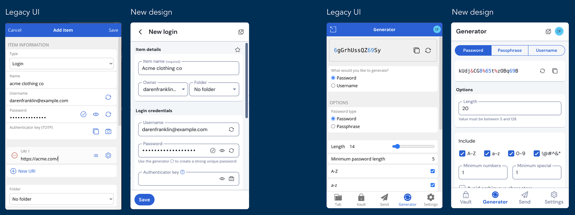
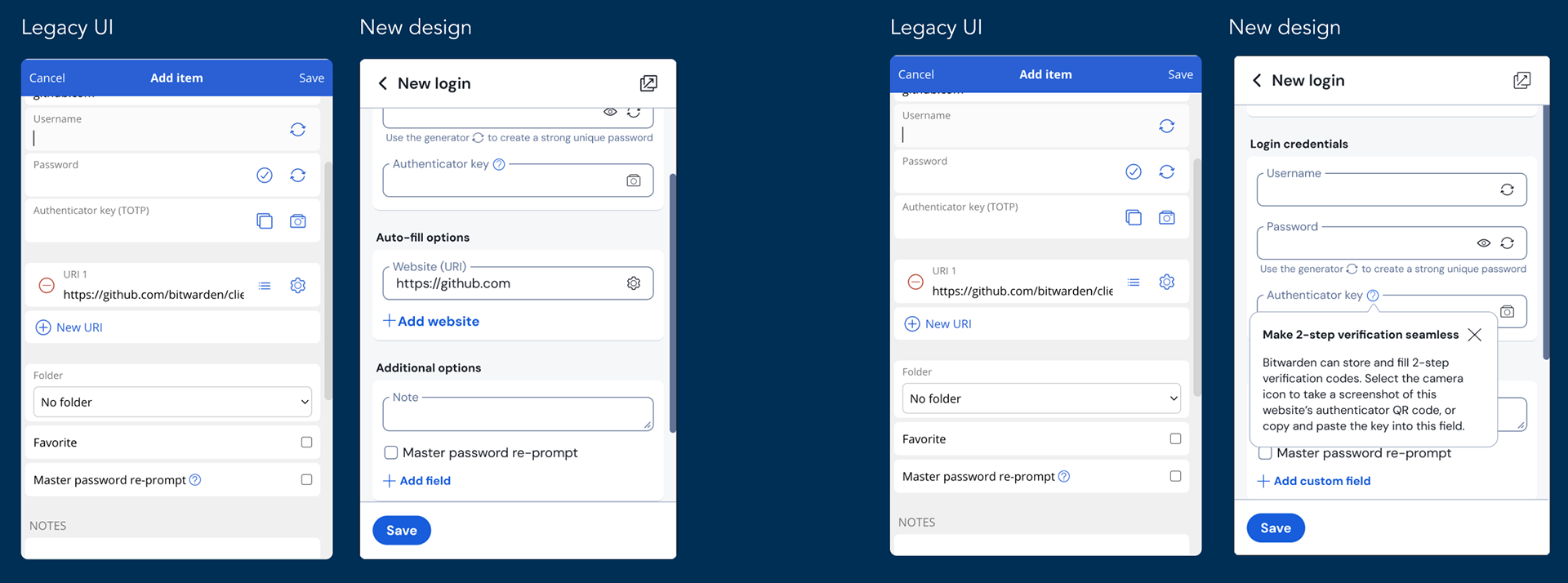
Updating Complex Concepts
To help simplify complex concepts, I updated labels and added additional help text to guide users.
Below you can see the label for the "URI" label was updated in the new design to "Website" and the interactions around it simplified. In addition, a popover was added to the Authenticator key field to explain the benefits of using Bitwarden for 2 step login
Adding Visual Delight
Throughout the design I worked to add illustrations to authentication screens and empty states to bring more delight and interest to the interface–especially for newer users.
During this phase, I collaborated with a contracted icon and illustration designer to elevate the legacy Bitwarden icons and illustration to more recognizable metaphors, consistent designs, and a more unique illustration style for use in the product.
User Response
User testing the prototypes showed
23% Increase in Visual Appeal
20% Increase in Usability
10% Increase in Overall UX
Beta Release
Prior to releasing the extension to the all 10 million users, I managed a beta release of the interface. During the beta I gathered user feedback resulting in:
• Resolving bugs
• Updating the Vault page to include a more prominent launch item action
• Adding a Compact mode option to increase information density
• Adding a filter toggle to allow users to hide filters when not in use
• Adding a custom width option to give users greater customization over their experience
Over 200 of existing users were surveyed during the beta to understand sentiment toward the update. Users rated visual appeal, usability, and overall UX improvement with a median rating of 4 out of 5 across all categories, meaning:
• The new more streamlined experience was intuitive to users.
• The new experience was more approachable and delightful for users to use.
• Users found the new experience an overall improvement from the previous interface
Impact
“Bitwarden's new design is like a fresh coat of paint on an old safe. Now it's both secure and stylish!”
–Bitwarden user
–Bitwarden user
“These are very welcomed changes. I've been waiting for a UI/UX refactoring on both the extension and the windows and android apps.”
–Bitwarden user
–Bitwarden user
“After walking 4 people with little technical literacy through setting up Bitwarden...it was much easier. The modern look helps with first impressions and acceptance. ”
–Bitwarden user
–Bitwarden user
“The redesign makes the browser extension look fresh, modern and more beautiful.”
–Bitwarden user
–Bitwarden user
“Bitwarden is an awesome password manager and this redesign brings a much more modern and user-friendly approach to the Bitwarden browser extension.“
–Bitwarden user
–Bitwarden user