

Summary
Bitwarden, an open source password manager, had end users and admins alike reporting that the web app interface was difficult to navigate and felt outdated. This was causing increased churn and the company to lose sales deals. To improve the user experience, I completed an information architecture audit, and a navigation UI refresh.
Impact
• Enhanced navigational structure and labeling
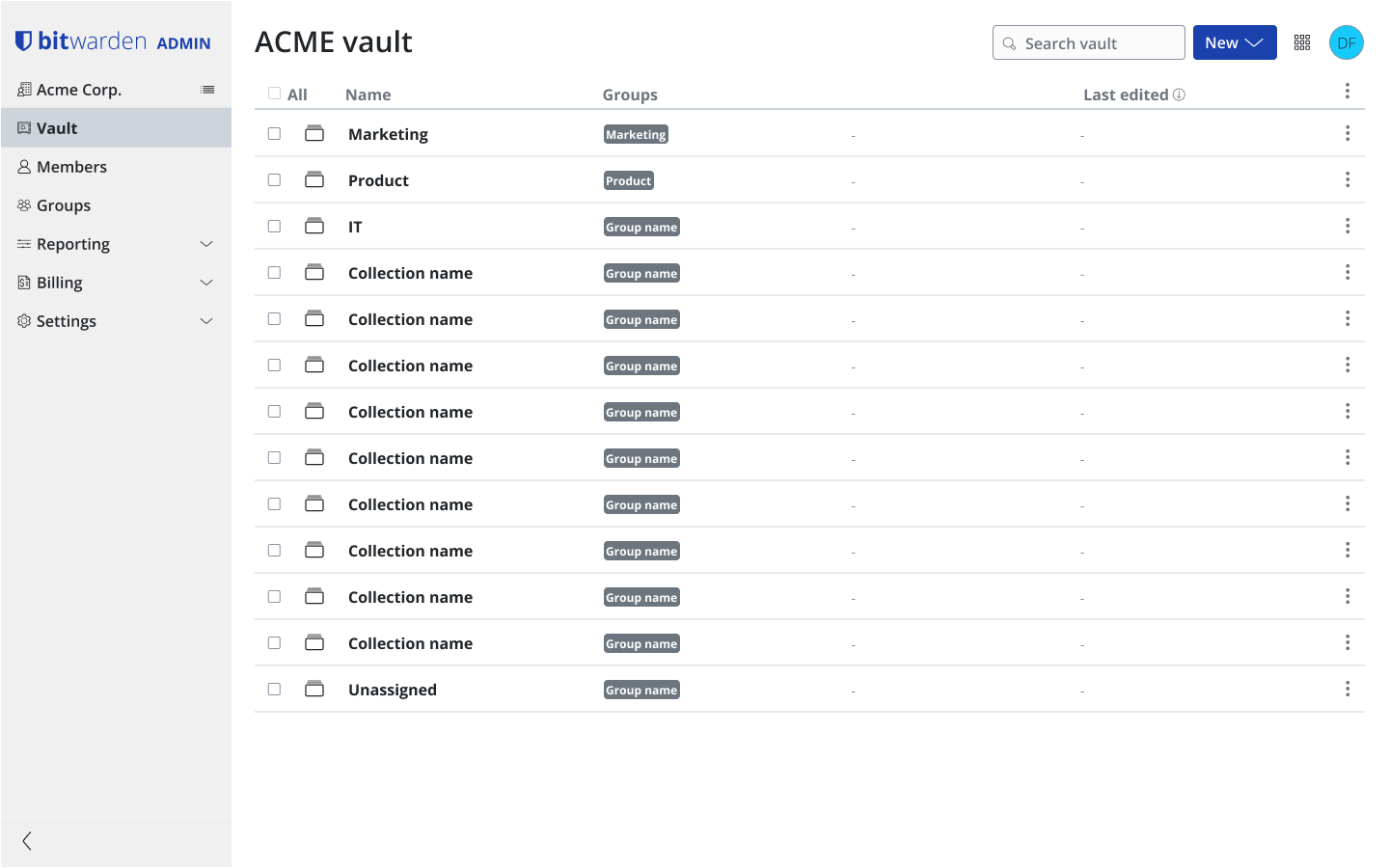
• The launch of the Bitwarden Admin Console
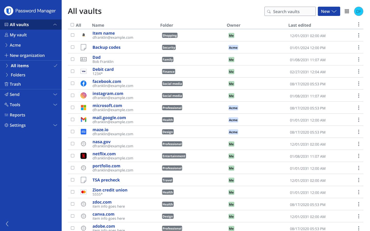
• Migrating to a more modern and easy to use Vertical Navigation
This project ultimately led to a more usable and delightful product experience.
Timeline 10/2021-03/2024
Major Tasks Develop UI/UX for web app IA update
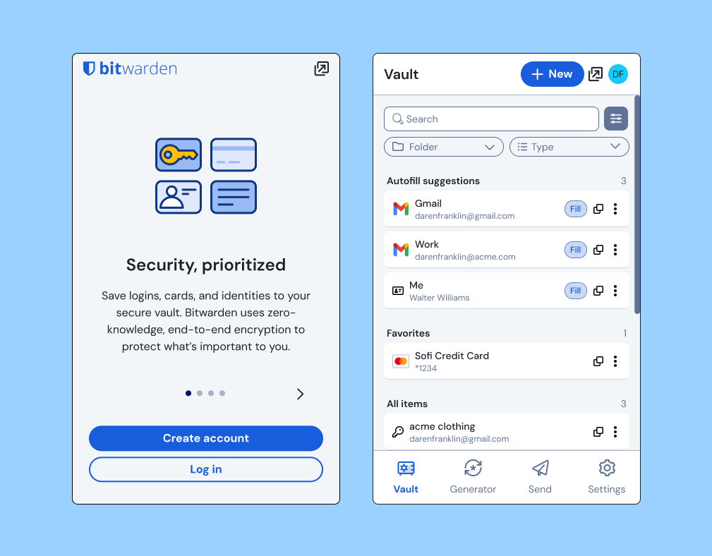
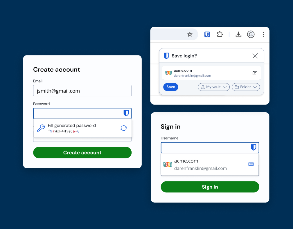
Platforms Responsive Web app and desktop application
Design Tools Figma
Playbookux.com
Maze.design
Playbookux.com
Maze.design
UX Methods General Research
Competitive & Comparative Analysis
UI Concepts
User Interviews
User Flows
Usability Testing
Prototype
Competitive & Comparative Analysis
UI Concepts
User Interviews
User Flows
Usability Testing
Prototype

Final design Prototype
Research and Planning
In the discovery phase, I completed a heuristic analysis, competitive analysis, information architecture analysis, and generative user testing. This helped me identify the following areas the needed improvement:
• Unclear what features related to which user persona (individual or business admin
• Data ownership is unclear
• Administrative navigation mimics end user navigation in a confusing way
• Content organization does not help clarify data relationships
• Majority of SaaS products use a separate Admin Console for administrative features
• Vertical navigation is common in all competitors and many other modern SaaS tools
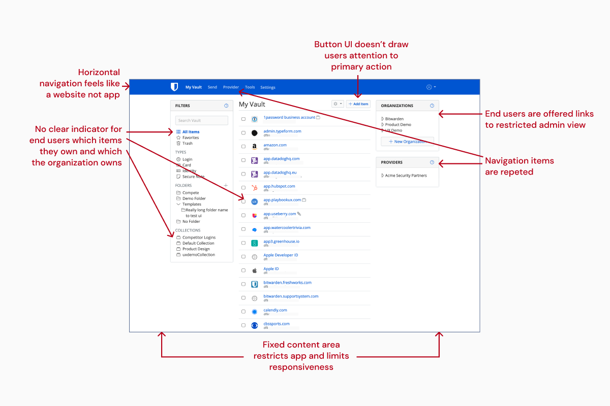
Legacy Password Manager interface

Legacy Admin tooling interface

Legacy Admin tooling dialogs
Information architecture
After gathering the generative research, I created a revised information architecture.
The updated organization primarily focused on:
1. Improved navigation labeling
2. Provided better separation between the end user and administrative features
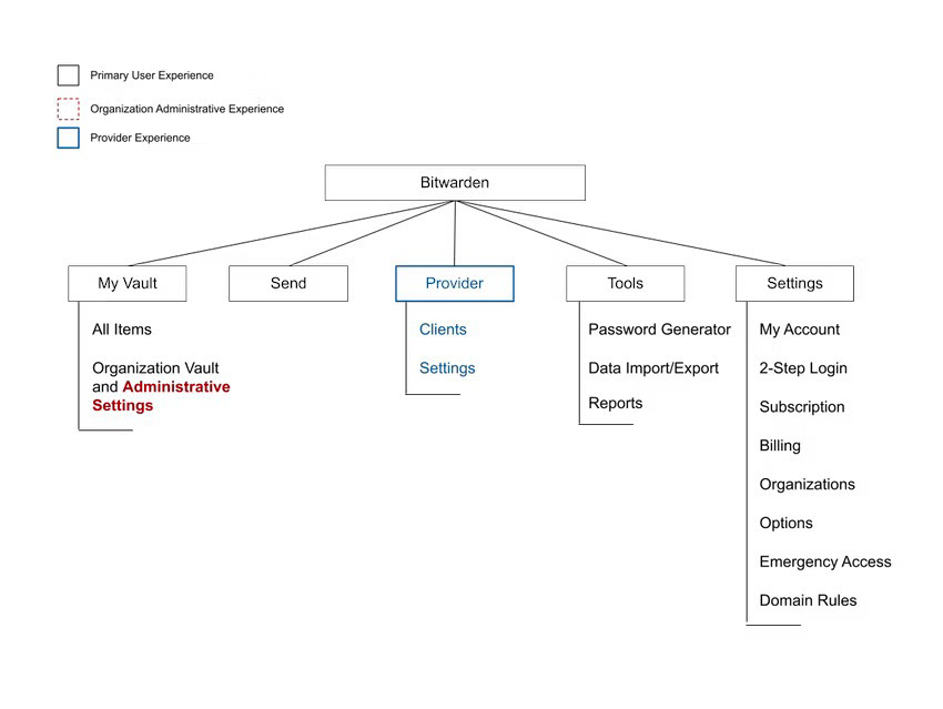
Legacy Bitwarden information architecture
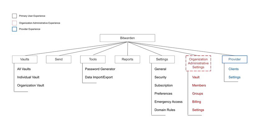
New updated Bitwarden Information architecture
Wireframes
With the information architecture in hand, I drafter low-fidelity wireframes for each screen. Initially these were created based on the app's current horizontal navigation so that the team could make structural changes while I continued iterating on a new vertical navigation pattern.
Admin new information architecture wireframe
Admin dialog wireframes
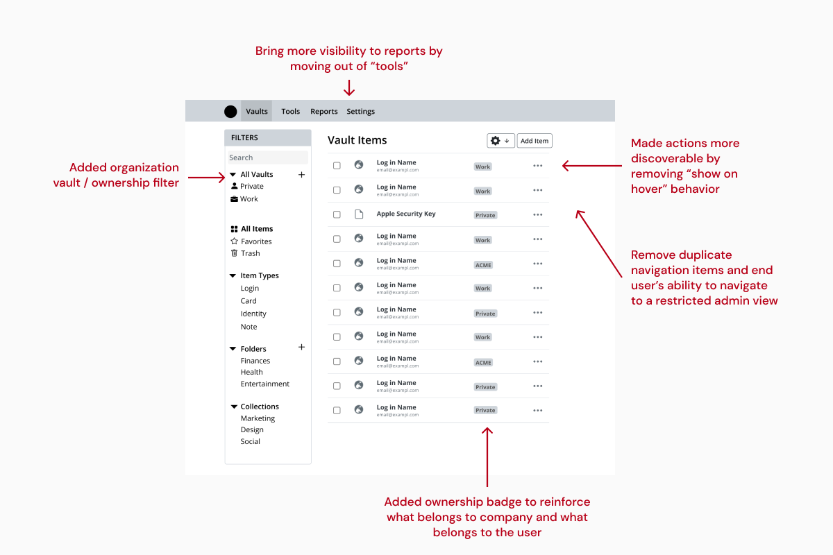
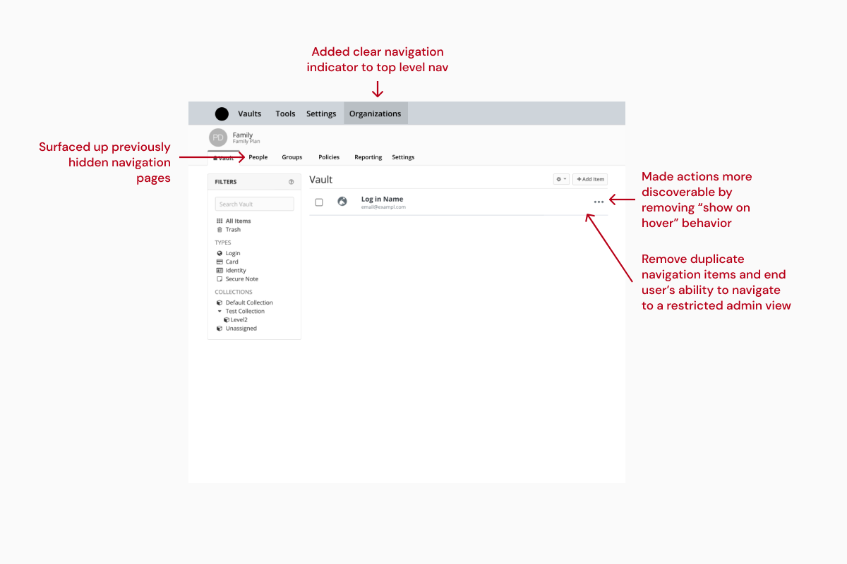
Navigation UI
With the structural navigation updates in place, it was time to apply a new navigation structure. From the discovery research it was clear me that a vertical navigation would best suite the product as it would elevate the design to a more modern visual appeal while also providing a more usable and app-like experience.
A few of the design iterations for the vertical navigation UI
Testing
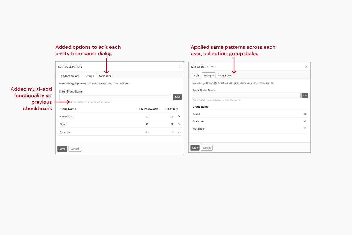
I completed usability testing with both end users and admin users using the new navigation and admin dialog patterns. The updated navigation pattern tested well with both users – the participants cited the UI as feeling "clean" and "modern" 2 terms I hoped to see.
One constructive takeaway from the test was the admins founds some of the dialogs still a bit lacking–so I revised the patterns used to include a multi-select input as well as a clearer permission structure.

5.6 - 6.8 average SEQ for end users
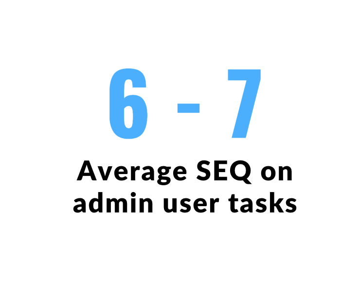
6-7 average SEQ on admin user tasks
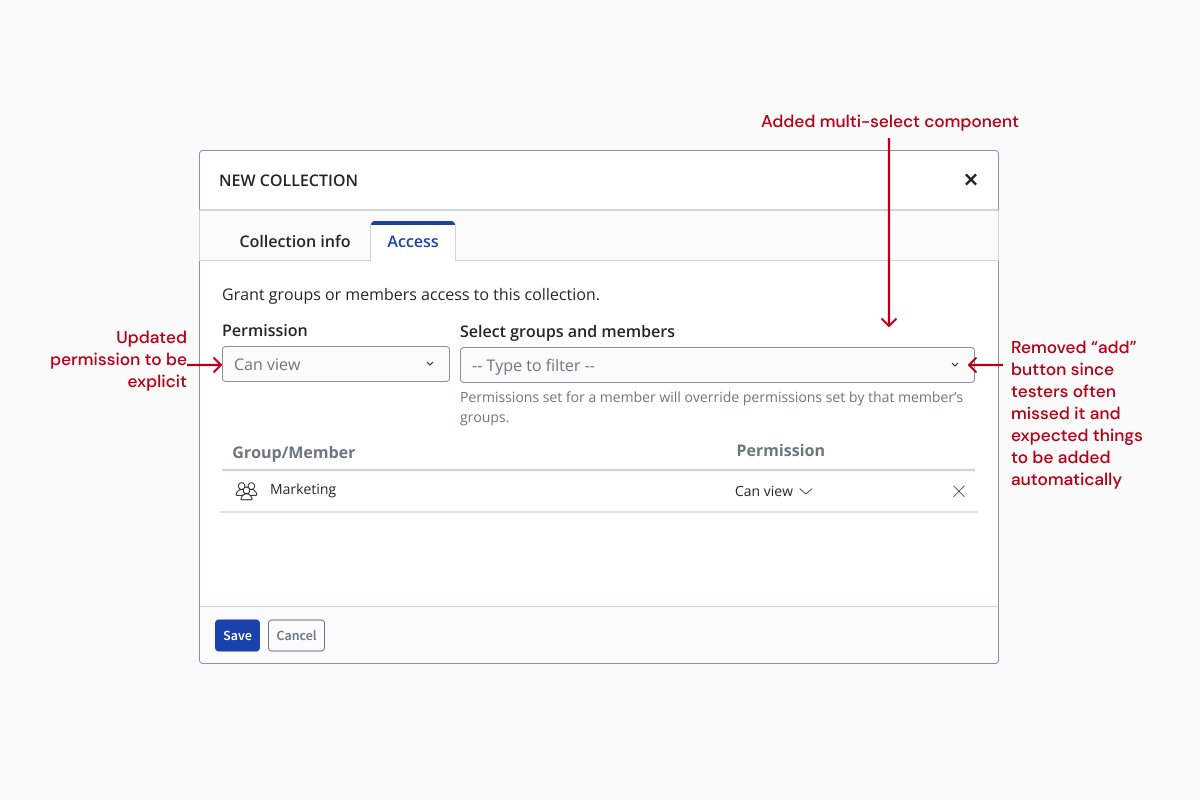
Updated dialog UI pattern based on user feedback
Handoff
The project was handed off to engineering in 3 phases:
You can read about each of the company's PR announcements for each release at the link included above.

Phase 1 - Password Manager structural changes

Phase 2 - Admin tooling structural changes
Phase 3 - Vertical Navigation on Password Manager
Phase 3 - Vertical Navigation and Admin console
My take aways
The updated navigational structure and UI was overall a success. Users responding positively to the updated UI, and the admin console users found the updated labeling and structure much easier to navigate and use.
I learned it is important to prioritize in app messaging and guidance when launching major updates. After launching the vertical navigation, I found that several users were confused at how to find the Admin Console–despite the pattern testing well in usability research.
The ingrained behaviors and habits of users led many to miss the app switcher in the top corner, this resulted in a revision to that aspect of the update so the Admin Console was included as a vertical navigation item for users who had permission to access it. Next time, I will push harder with the product and engineering teams to include more in-app messaging to ease user transitions.
This is great. It's a lot better than it used to be, so congratulations on the achievement!
–Bitwarden user
The website is so, so much better. Seriously great job on it. Now do the browser plugins and the whole game will change!
–Bitwarden user
Very good. Just by the look/explanation in the blog, I like it better than the old interface already. I hope your corp customers massively like it. Thank you!
– Bitwarden user